Saturday, December 11, 2010

Final Laps

This was a pen and ink illustration I did a few years ago but it seemed to fit the theme!
My mother used to say, “If you don’t have something nice to say about someone, don’t say it all!” Words to live by, and I’ve tried to expand it to include “interesting”, “intelligent”, “informed” or “funny”, and then broadened the whole prescription to include most of what comes out of one’s mouth. It makes me a poor choice for a cocktail party companion as it puts severe limits on mindless banter.

As I start on the last bits of Big City Otto I’ve sort of dried up regarding what to be writing about in this blog. Nothing seems to resonate, and unlike my illustration work, I’m actually feeling a bit blocked. My partner Esperança attributes it to the whole project drawing to a close and she may be right. Or maybe I’ve talked it all out.

Last summer, in the early days of starting this blogging project it was the opposite, with ideas for posts stumbling over each other in their hurry to barge their way to the front of the queue. And I’m sure more things will come along in the future, as the book winds its slow way through the production stages to finally emerge sometime late next summer as a published work. But for now, things are just quietly winding down.

So that’s it. I just wanted to give the heads up to anyone following my adventures (both of you!) or those who may stumble on this blog in the interim, that it might be a wee bit quiet here. Eventually it will all probably be rolled up and put on some sort of more official “Bill Slavin” page as a link that the present URL directs you to. (That’s presuming I actually join the 21st Century and make myself a web page.)

In the meantime, I hope that what you’ve found here has been at least a little bit interesting, and possibly informative, and, dare I say, funny. And, in the spirit of the season and true to my mother’s wise words, short on naughty and long on nice.

Happy Holidays!

Sunday, November 28, 2010

Blowing Things Up

Page 62, inked final, of Big City Otto.
I realized, as I was inking Page 62 this week, that I love to blow things up. Not literally, of course – I’ll leave that to the professionals, fanatics and inspired lunatics that seem to populate our world these days. But when it comes to putting pencil to paper, I love blowing things up.

I always have. Most boys do. It’s why their earliest art is filled with vast and complex panoramas of huge battle scenes, planes going down in flames, limbs severed, blood spurting. I was as guilty as the next.

One of the less gruesome battle scenes that filled my childhood sketch
books. From Zok the Caveman, drawn when I was 8.
And when I wasn’t busy blowing things up on paper, I was out playing complex wargames with my friends. Armed with homemade weapons (my parents refused to buy me guns), my wooden commando knives lovingly shaped and sharpened on my father’s grinder, heavy machineguns created from gasoline cans, wooden submachine guns and rifles, we would do battle for hours on my friend’s farm. In the back forty we had constructed a trench system, complete with barbed wire, sandbags and roofed bunkers, on a sand slope that would have been the shores of Lake Ontario in some bygone era but now became the beaches of Normandy, fought over time and time again. Or in my own homemade bunker in a sand pile next to our house I would spend hours in solo combat with the Nazi aggressors. As Harry Pearson puts it, in Achtung Schweinehund!, his hilarious homage to toy soldiers and growing up in the 60’s, “To me, the Summer of Love was a six-week school holiday filled with Stukas, swastikas and bazookas.”

Some see this as a boy’s morbid fascination with war. The art of destruction. But I think it’s something else. I think it is a boy’s love of action. There is nothing more action-packed than play battle (not war, which is famously and drearily long periods of inaction punctuated by brief moments of sheer and utter terror). Take out the actual dying and carnage and you can begin to see the adrenaline-stoked fascination with the running, jumping, diving for cover and shooting. Today’s first person shooter computer games serve the same function - without the exercise.

For some of us, we never out grow this fascination with pure, unadulterated action. For some it takes the shape of contact sports, or racecar driving or mountain climbing. And for the less adventurous it may take shape on paper.

I’ve said before that to truly inhabit my drawings I have to, at some level, actually be living those things that go down on paper. It’s one of the greatest pleasures of my work, the opportunity to inhabit worlds, do things that I would never be able to do in real life. And never do I more fully inhabit that action-packed world than when things are blowing up. Gravity no longer becomes a factor, items become air borne, everything disperses from a central point on the page. There is exhilaration there.

Which is why you will never see me creating a more serious graphic novel. The idea of drawing panel after panel of people indulging in intense conversation as they work out or relive their less-than-exciting lives won’t be what I’ll be drawing. I’ll be the kid with the water gun, down in the shallow end of the graphic novel pool, blowing things up!


Friday, November 19, 2010

Milestones


When I penciled my last pages this week I realized I was saying good bye to Cajun Joe. It was a bit sad to think I wouldn't likely be drawing him again as I bundled him into a paddy wagon. But never say never. Here's my penciled rough for Page 79 of Big City Otto.


So congratulate me. I finished penciling the last page of my book today.

That’s not to say that I’m done. There are still twenty pages waiting to ink and colour and then all of the compilation at the end, but none-the-less, a milestone has been reached!
I won’t make the same mistake that I made when, after months of work, I finally finished the thumbnails for this story. I remember sitting down in a comfy chair on my back porch, cracking the spine of the big black sketchbook that contained all my labour and reading through the story from start to finish.

I was done in fifteen minutes.

It reminded me of the time a friend and I decided we were going to bike around the coast of Cornwall. We rented a couple of old clunker three-speed Raleighs, hoisted our army-issue backpacks onto our backs and set off. For two days we crawled up and down the indented coast, clawing our way out of one fishing port after another as we followed the undulating coastal road. On the third day we woke up exhausted, packed the whole thing in and caught a train back to Plymouth.

In fifteen minutes we whisked by all those hard-gained miles and were back where we started. Fifteen minutes. It was a bit like that.

I have to remind myself that it isn’t the single reading that justifies all the work but the cumulative hours and hours of all those readings by adoring fans that make it all worth while. That and the fact that there’s nothing I would rather be doing in this world than drawing comics.

And this is merely a slender eighty-page volume. At the moment I’m working my way through Craig Thompson’s graphic novel, Blankets. Six hundred pages of beautifully rendered black and white drawings. Now there is a labour of love!

Really, these comic book artists should be canonized. Not me – I’m taking a bit of time off to pursue a childhood dream – but I’m thinking of those who have made a career of it, pouring their hearts and souls into pages and pages of drawings. Don’t think for a minute many are getting rich on it. Personally I think comic book artists are the great unsung heroes of contemporary art. The very best are the modern day counterparts to artists like Durer, Rembrandt, Doré and Goya - consummate draughtsmen who could render beautifully and prolifically. Today’s comic book artists keep alive a tradition centuries old – the art of drawing. And they continue to stretch and explore the boundaries and possibilities inherent in visual story telling.

So take a bit of time the next time you read a graphic novel. Take a moment to get beyond the words and into the visual story that the artist has laid out for you. It’s a sumptuous feast, not to be bolted down quickly but savoured and appreciated. And remember that it was a remarkable amount of work that made that meal possible.

They deserve to be congratulated.

Monday, November 8, 2010

Negotiating the Minefields of Political Correctness

Pencil rough for p. 65 of Big City Otto. This is the version you won't see in the book with offending lyrics, keg-shaped GatorJuice container and the pending-lawsuit logo still present.
This was one of those weeks where you really wonder whether it’s all worth it.

I never pick up my pencil to draw thinking, “What would a kid like?” Instead I trust in my inner twelve year old and simply put those things down on paper that make me laugh. As a result I sometimes forget that I’m doing a comic that’s ostensibly for kids.

I think comics can work at a number of different levels and, like the animated films we see in theatres, are filled with bits and references that only an adult audience is going to get. But for some reason we set the bar a bit higher for children’s books, probably because they have to run the gauntlet of administrative approval in order to get into schools, rather than simply the court of public opinion. But I’m also very aware that I am the product of a different generation, growing up on a steady diet of Bugs Bunny cartoons and Asterix comics. So my compass for negotiating all of this may be a bit rusty.

I don’t blame my editor, who's the best of the best. In this case she’s merely the messenger for an industry that is concerned over possible lawsuits or books being rejected by certain markets. She suggests these should be my concerns as well, (which they are not) and says the worst part of her job is when she has to come to authors with these sorts of requests. In the end it’s a fine dance between the publisher’s needs and what I feel is right for the book. But sometimes the comments continue to baffle me.

For instance, here are a few things I learned this week:

1. Gangstas aren’t gangsters.
I actually almost get this one, but I was still surprised when any direct reference to “gangstas” wound up on the cutting room floor. I’m no fan of gangsta culture and believe that it is wreaking a terrible toll on disenfranchised black urban youth and should not be glamorized or re-enforced. But in my comic I honestly thought I was satirizing white suburban youth who emulate the culture, and am ancient enough to still believe that satire can be a powerful force for good. (See previous post, Alligata Gangstas). But I guess ten year olds might not get satire, although I’m suspecting more likely it's adults without a sense of humour.

2. No drinking allowed!
Loose women have never been my forté so at least I avoided that pitfall! And even I knew that Otto is an innocent at large and probably shouldn’t be seen indulging in under age drinking. But I hadn’t realized that even oblique references to drinking must be expunged, even when the binging is on energy drinks and junk food. (Maybe you have to be fifty and a victim of clean living before you can contemplate the fact that binging on junk food can lead to hangovers!) So the keg-like container for the “GatorJuice’ becomes a giant pop bottle and next-day head aches become tummy aches, and slowly I can see that all references will have so completely disappeared that what I thought was a relatively innocent joke will be lost! Sigh. Deep breath …

In a pathetic attempt at rebellion I drew the line at ridding my junk-food-hung-over heroes of their “queasy bubbles” over their heads, arguing that they weren’t only cartoon short hand for inebriation but also for tummy trouble.

3. … Or smoking!
I found out that good guys can’t smoke and apparently this can extend to bad guys if the audience is perceived as being too young. Big Al was able to keep his cigar, (it was suggested that it not be lit but I happen to like drawing smoke) and I honestly think that his stunted growth makes him a poster child for NOT smoking. But you won’t see any sign of a cigar on the book cover. Non-negotiable I’m told.

I could go on, but these were a few highlights. Threat of lawsuits, real or imaginary, have already seen my arch villain, “The Man in the Ten Gallon Hat”, become the “Man with the Wooden Nose”. And probably none of these changes on their own are going to make or break the success of the book. But bit by bit they do chip away at the original cohesive concept and do, at the cost of not alienating any markets, end up creating something that’s less than it could be. And in the end we’re left with a degree of self-regulation that maybe gets so good at anticipating the market’s response that it stops taking the chances one needs to take to create something of value.

Not that I’m trying to do important art here. But fo' shizzle, jus' 'cause I’m drawin' talkin' elephants don’ mean my book's fo' ankle biters! I just happen to like drawin' talkin' elephants, dawg.

Next week (or sometime in the future):  A cautionary tale about the Comics Code Authority and its effect on the North American comic industry.

Tuesday, November 2, 2010

Winsor McCay – Something from Nothing

I took the week off from Otto to do some odds and sods including this rough 
for Know Magazine on Winsor McCay. It got me to thinking …

I took a break this week from working on my comic to do some other stuff that had wandered across my desk. One of those things was a bi-monthly installment for Know Magazine, a children’s science magazine that I have a regular gig with, producing a one-page comic called Great Moments in Science. This month’s issue was on animation and I was given the choice of a piece on Walt Disney or the lesser-known Winsor McCay.

Like a shot I opted for Winsor McCay, (as Disney already gets far too much press!)
For those of you who don’t know, Winsor McCay was a cartooning and animation pioneer who created the first commercially successful animated film, Gertie the Dinosaur. He was also the creator of the comic strip Little Nemo in Slumberland, a strip that still stands head and shoulders above most because of its beautifully designed panels and intricately realized artwork.

But while researching the history of his early animation attempts, two things struck me. The first was that, prior to making his film, McCay used to entertain audiences in Vaudeville shows where he would speed draw characters and tell stories. I found this interesting, the whole idea of producing visual art as live entertainment, because in some ways this is an idea that really has come back to the forefront via the Internet and Youtube. There are a plethora of visual-art-as-live-entertainment videos out there, one of the most striking examples being the evocative sand drawings of Ukranian artist Kseniya Simonova.

On a personal note, I’ve been toying with the idea of filming my drawing of one of the pages from Big City Otto and putting it out there for people to take a peak at. I’ve already made one failed attempt (as I got into my work my head gradually impeded into the frame until all you could see was a giant bald spot!) I figure now that this will be something I will tackle when I have finished the first book and have some more time on my hands. And I will wear a hat.

But I want to do this because I know people love to watch others draw. I do. It’s that magic of pulling something from nothing which is - just that - magic. When I visit schools I usually do a bit of drawing for the kids and you can hear a pin drop when I’m in the middle of doing that, the kids are so engaged in watching me work. I remember once sitting by a roadside in the Azores with my wife Esperança, and the two of us were sketching some Portuguese cottages. A group of country kids came up and started watching us and for more than an hour they just stood there in rapt attention, not uttering a word, until their mother, worried they were bugging us, called them home. It was remarkable.

Which leads me to the second thing I discovered while working on this one-page comic. I thought that it was interesting that when Winsor McCay created his first film, Little Nemo, the audiences didn’t really understand what was going on up on the screen. They thought that the animation was created somehow with wires, filmed in real time. But it wasn’t just a failure to grasp the technical aspect of it, a succession of drawings flowing together to create the illusion of movement. When you think about it, those first animated films really had done something truly remarkable. For the first time in human history the images in a person’s mind had been taken out of their shell and made to move and interact in front of the audience. Today’s audiences, glutted with special effects, take all of this for granted, but those very first audiences were simply baffled by something that had arrived in their world that they had never experienced before. In a sense it was the next quantum leap from when a caveman picked up a stub of charcoal and captured a beast from the fields and placed it on the wall.

Winsor McCay had created something from nothing.

Tuesday, October 26, 2010

Mr. Parrot Pockets

If Pluto’s a dog, what’s Goofy? It was this sort of question that should have plagued my generation growing up, but in all honesty, I think most of us just took all those anthropomorphic inconsistencies in stride. We all knew how it worked, the clothes made the man –er – dog –er –man/dog, and an unclothed animal was, well, clearly an animal. Speech balloons or the absence thereof sealed the deal.

It’s that sort of interior logic that allows an elephant to wander unnoticed in the streets of New York City. On first landing Otto obtains some stolen clothing from the unclaimed baggage area, and after that, clothed only in a fedora and trench coat, he is now mistaken for merely a largish human. At least by the less-than-curious occupants of a big city.

The parrot is taken at face value because we all know parrots can talk. So it’s a small leap of logic that allows Crackers to have a conversation with a bartender. And other animals can always recognize and communicate with one another, despite the presence or absence of clothes, because of the universal bond of animalhood. Or something like that.

Okay. So it doesn’t make sense. It’s why I love this medium called “comics”. The reader is a willing accomplice in a suspension of disbelief. But dubious logic aside, the real challenges in anthropomorphism from a cartoonist’s perspective are simply those created by an animal’s physical characteristics. Crackers’ wings transform relatively easily into large fingered hands when necessary, but Otto creates more problems. I mostly imagine him as a person in over-sized oven mitts (without thumbs) which allows him to grapple with most things. Catching cabs, (literally) blowing his nose, holding a bowl. I’ve even managed to squeeze a pointing finger out of him, but not easily. (Fortunately elephants are one of the few animals that walk the same as humans, not tippy-toed but flat-footed, so at least his knees bend the right way, anthropomorphically speaking!)

                              
Parrot wings morph fairly easily into hands but the large saucer-like foot pads of Otto create challenges for  even the simplest gestures, like pointing.
Then there are the Alligari Boys, alligators so acclimatized to life in the big city that they have taken to wearing human clothes. Big Al has even elected to go for patent leather shoes! But again, although their claws are more easily adapted to being hand-like, I did run up against the problem of their arms being too stubby and low down on the body to easily reach their snout. Mostly not a problem other than when they’re shushing Otto, like the image below …
The stubby legs and long snouts of the alligators make hand to mouth gestures a bit tricky. It could only be managed by a hunching of the shoulders and getting the alligators to bend into the pose.
But it’s the inconsistencies around anthropomorphism that can be the most fun. Maps mysteriously appear and disappear in Cracker’s plumage, but when he pulls out a bill to pay the cabbie, Otto really takes notice. His realization that Crackers is carrying around cash leads to the following exchange, as jet lag and the frustration of their search for Georgie finally blows the top off their collaborative efforts.
The inked drawing for p. 52 of Big City Otto that I was working on this week. The bottom right panel is one of my favourites in the book, as Otto and Crackers square off eyeball to eyeball.

Tuesday, October 19, 2010

Elephant Thumbnails


Above you can see the thumbnail and subsequent pencil rough for p. 62 of Big City Otto. I'm constantly referring to my original sketch in order to capture the spontaneity and energy as I work on my finished pencils.

In my on-going education and elucidation, I can say, unequivocally, that elephants do not have thumbnails. Toenails, yes, and lovely ones at that, but the lack of thumbnails is inexorably hinged to the lack of thumbs which creates no end of troubles for an illustrator who needs his elephant to, well, hold things. But that remains for a future post – the visual pitfalls of anthropomorphism!

In talking about storyboarding, or thumbnails, I’m really reaching into the vault here, as this was a process started over two years ago. Much of the original storyboarding for Big City Otto (book one of Elephants Never Forget) was done on a trip to the Azores, my partner Esperança’s birth place, in the summer of 2008. It was a memorable trip for the fact that most of my two-week stay on those beautiful islands was spent in the hospital waiting room, while Esperança attended to her mother who had become quite ill a few days after our arrival. Fortunately I had the Otto manuscript and my sketchbook in hand, and the visual story just poured forth over that time and the weeks following when I returned home. I remember it as a golden summer spent sitting and drawing on my back porch while the weather held. It was a very creative time, working with nothing more than pencil and sketchbook, liberated from art table and computer screen, and really just letting the creative juices flow. It was the cliché of the artist’s life and so far from the reality of what it usually takes to make a living as an illustrator.

The months of work spent on those thumbnails was all speculative work, something that is familiar to the writer but less so to the illustrator who usually has contract in hand before pencil goes to paper. But the fruit of those days’ labour was a fully-realized manuscript complete with sketches, and I honestly believe that this lead to the subsequent acceptance of the story for publication.

When I speak of thumbnails here I’m really referring to the art of storyboarding, or getting the story down in small simple quick sketches. It is at this stage that I’m working out points of view, lights and darks, where the text will likely fall and how the action will be communicated over how many panels of storytelling. The thumbnailing is always the most creative part, in my view, of the entire process, a chance to tackle the bare bones of the visual narrative without getting hung up searching for references or fine-tuning the drawings. That all comes later, once I settle into the pencil roughs, many of which I’ve reproduced previously here in the posts of this blog.

But the thumbnails are really the heart of the whole thing. It is where I get my hands deep into the clay of storytelling, and in those thumbnails lies the energy and compositions for my later drawings. I refer constantly to these small sketches as I work on my pencil roughs. When I stray too far from those original imaginings the picture starts to loose its energy, gestures become wrong, angles of view too acute. So I constantly find myself returning to those very first spontaneous sketches to bring myself back on track, to those sketches that will serve as a road map for the months and months of hard work that still lie ahead. 

Sunday, October 10, 2010

Toilet Humour and Brainstorming Otto

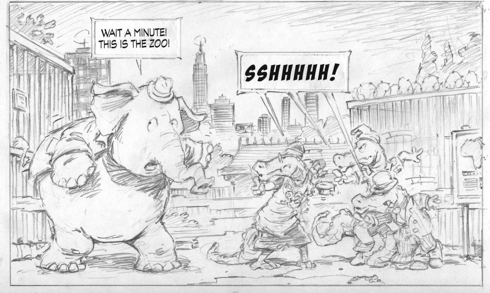
Above is the pencil rough for Page 36, part of the scene described below. One of the wonderful things about doing comics is that the usual restrictions of reality aren't a hindrance. This means it's completely acceptable for an elephant to be stuffed into a port-a-potty and then hoisted to the top of a high-rise. In fact, not only acceptable but actually rather funny.

I’ve talked a little bit in an earlier post about how the idea of Otto originally emerged (http://www.billslavin.com/2010/07/star-is-born-imagining-otto_9811.html) but thought some of my readers might be interested in the brainstorming process that leads to ideas getting organized and on paper.

Most of the first book of Elephants Never Forget was written episodically. That is to say, once the arc of the story had been established ( Otto and Cracker's journey to America in search of Otto’s kidnapped pal, Georgie the chimp) most of the rest of the story was constructed from a series of scene ideas. These ideas usually came up and were fleshed out in brainstorming sessions conducted during regular evening walks with my partner Esperança Melo. Most of the best ideas were Esperança’s and would usually come from a conversation that went something like this:

Me: So, Otto and Crackers find themselves adrift in this huge metropolis, looking for his pal Georgie. What happens next?
E: Otto might get stuffed in a Porto-Potty.
Me: What?!!
E: A Porto-Potty.
Me: (dense) Why a Porto-Potty?
E: Well, he’s in the city and he has to go to the bathroom somewhere, and an elephant in a Porto-Potty is funny.
Me: (thinking now this isn’t such a whacky idea) Okay. Poop humour is funny. But why would there be a Porto-Potty?
E: Well maybe it’s on a construction site.
Me: (more enthusiastically) Yeah. And maybe he has to go to the bathroom because he ate a box of prunes or something.
E: That would have happened sometime sooner.
Me: Sure, like when Otto and Crackers first arrived in the city. Remember, he was hungry the whole time on the airplane and on the baggage carousel, so he may have done something ill-considered like eat a box of prunes. Maybe from an early morning delivery van when they first get into the city proper.
E: (still with the Port-a-Potty) It would be funny if the Port-a-Potty is being lifted up on a platform by a crane …
Me: What??!!
E: It would just be funnier if it all happened while being suspended from a crane.
Me: (hesitantly) Oookay. That might work. Sort of a Buster Keaton high-wire act?
E: Exactly,
Me: (gears churning) And actually that could work quite well, because once he gets out of the Port-a-Potty he would be way up in the air, and maybe for the first time gets a glimpse of how huge the city is! Like a great concrete jungle – an obvious metaphor for an elephant, don’t you think?
E: (uninterested in my elephant metaphors) Sure. Whatever. And maybe he sees an organ grinder and his monkey below in the street and thinks that it’s Georgie.
Me: That could work.
E: It would be really funny if he ran into a monkey on the street who was part of a flea circus.
Me: What??!!!

This is typical of our collaboration around the writing, with Esperança coming up with the wackier and more original ideas, forcing me to then think out of the box. Then I run with it, taking all the good stuff, writing up the scene descriptions and dialogue and figuring out how it fits into the narrative as a whole.

There are many ways of writing for a graphic novel, some highly descriptive, others sketching things out in the broadest strokes possible. Because I have the luxury of being both lead writer and illustrator, my scenes and even panel breakdowns can be fairly loose allowing me to fill in the details later. I will speak more about this in another post on storyboarding the book.

At any rate, all of the discussion on our walk (other than the flea circus bit, which made no sense whatsoever!) led to this written scene:

High Wire Scene

Panel
Caption: Hours later …
Scene: Otto and Crackers walking down the street despondently.
Crackers: Cripes! We’ve been searching for ages!
Otto: I gotta go.

Crackers: Go? Now? We just flew 3000 miles to get here and you gotta go?

Otto: No, I mean go! You know–
Crackers: Ah, jeez! This ain’t the jungle, Otto. You can’t just go anywhere.

Scene: Now walking past construction site. There’s a Johnny-on-the-spot present. A construction worker has just left it, buttoning his pants and whistling.
Crackers: See that little house? You go there.
Otto: It seems a bit small …

Scene: Otto trying to get through doorway. Crackers pushing from behind, head under Otto’s behind.
Otto: It would be much easier if I could just-
Crackers: Don’t even think about it!

Scene:
Otto is now inside. Crackers is pacing out front, with back to toilet. A crane is lifting a chain that is attached to the four corners of a skid that the toilet is standing on.
Crackers: Just let me know when you’re done.
Otto: Okee-Dokee.

Scene: The toilet is now lifting up. Crackers still has his back to it.
Otto: I’m feeling much lighter.
Crackers: Just hurry up, would ya?

Scene: Crackers is still facing away then turns, doing classic double take. The toilet is gone.
Crackers: I told you not to eat all those- Whaaa-?!!

Scene: From below, Crackers (in shadow) looking up startled as a sky crane hoists the platform with the toilet up into the air, towards the top of a skyscraper under construction.
Crackers: Otto!

Scene: Crackers chasing after platform. Otto still inside.
Crackers: Otto! Otto!
Otto: I’m coming! Just a minute!

Scene: Crackers now fluttering outside door. (Flush! coming from toilet.)
Crackers: No, Otto! This is bad! You gotta get outta there!

Scene: Door opens. Otto steps out.
Otto: So what’s the -

Scene: Otto jumps back, hugging toilet. Toilet tilts on platform.
Otto: Aaargh!

Scene: Toilet tumbles off of platform. Otto is following it, flailing, but Crackers has grabbed him by the tail.
Otto: Aieee!

Scene: Otto is pulled back onto platform, and grabs chain, shaking. Platform is tilted dangerously to one side.
Crackers: Steady, big boy. Steady. Just make your way over to the middle here …

Scene: Otto has made his way to the center of the platform. He’s looking out on the panorama of the city below.
Otto: It’s huge! Like a massive jungle, but made out of- umm …
Crackers: Concrete?

Scene: Close up of Otto. We can see a tear in his eye. Crackers looks on with concern.
Otto: Sniff! We’re never going to find Georgie, are we, Crackers?
Crackers: Sure we will, big buddy.

Otto:(Crying inconsolably) No we won’t! It’s hopeless! Boo hoo hoo!
Crackers: Easy, big fella. You gotta get a grip.

Scene: Otto suddenly wiping away tears, pointing excitedly at a tiny figure below. The whole platform tilts dangerously again.
Otto: Wait! I see him! There!
Crackers: Where?


Saturday, October 2, 2010

Some Thoughts on Visual Literacy

Below is a bit from a talk I did a couple of years ago at the Saskatchewan Reading Council conference in Regina. I think I alienated half my audience and bored the other half (note to self – don’t try to do any heavy-thinking at a luncheon key note) but I think the thinking is good enough to share here and ties in directly to the value of graphic novels in libraries and classrooms.


The adage goes, “A picture is worth a thousand words.” But I think there are few things in this world less well understood then the art of visual communication. My profession uses pictures, an even older form of communication then the printed word, and the basis of most of the world’s alphabets. For us visual artists, words are the new Johnny-come-lately, and although expedient and easy to use, still viewed with suspicion.

Going back to pictures, we can remind ourselves that there are and always will be many ways and means to communicate. Every pre-literate child begins their relationship with books through the pictures in picture books, “reads” the stories through those pictures and uses them as a spring board to understanding those arcane marks on the page we call words.
Because, as we all know, the pictures are the first key to a story in the preliterate mind. Like those massive and age-darkened canvases that loom out of the shadows on the walls of ancient churches and cathedrals, a picture book’s illustrations are there to bring alive and communicate a story to an audience that is unable to read.
I think at some point many of us lose our ability to “read” the visual, slip into a sort of visual illiteracy in a sense, as we attach more and more importance to the words that symbolize things, and stop truly seeing the pictures that may accompany those words. I constantly see evidence of this – from the fact that children often recognize what is developing in the narrative of a story, by reading the visual clues, before the adult does, to picture book reviews that give only a cursory note to the illustrations or fail to mention them at all. I’ve even read reviews that attribute entire portions of the narrative to the author that were only told in the illustrations and were the illustrator’s contribution to the book, a case where the reviewer is so blind to the role the illustrations play in telling a story that they didn’t realize part was being told in the pictures.
I remember reading a short story once, by C.S. Lewis, I think. In this story he describes a series of passing images, amorphous and indistinguishable blobs of shape and colour, with no real discernable pattern. At the end of the piece you discover it was a trip in a car, seen through the eyes of someone who has become so separated from their ability to actually see, that this is what their visual world had been reduced to. I think we are all born with the ability to truly see, but as we start to order and make sense of all of this stimuli entering our brains, we slowly prioritize and discard, give names to objects, and in naming them, stop seeing them for what they truly are. So a “chair” becomes the archetype of a chair, the word “tree” becomes a substitute for all trees in their many and varied guises, and in the end we rely heavily on a literal shorthand for this visual world around us, and stop effectively seeing. We all do it, even artists, but I think the artist, by constantly exercising this part of his brain, perhaps holds on a little more to the ability to actually see as we did when we were children.
But in this world we all live in, bombarded constantly with visual imagery, perhaps we all need to relearn, in small ways, how to see properly. It could well be that today’s children and even their young parents are one of the most visually literate generations this world has seen – children raised (some might say gorged) on a banquet of imagery, from television to computer games. Comic books are being read, not so much by children, but by a generation well into their twenties and thirties. It’s the same generation that is driving the computer game industry. Pictures are no longer just kids’ stuff.

Friday, September 24, 2010

How to Colour Otto or Everything I Know about Photoshop

Okay, kids, time for a tutorial. But before I get started, I just want everyone to know that I'm no expert. But I do have one golden rule, and if you can remember this then ninety percent of your grief will be solved.
Golden Rule #1: If you can't do what you want to do, you are either:
A On the wrong layer or, more likely …
B Have something selected somewhere. Hit deselect and try again.

Unlike many of my younger brethern and sistern who have had computer art hard-wired into them along with their mother's milk, I had to learn the difficult way. I started out colouring on the ICON computer (a footnote in government attempts to develop a made-in-Canada computer industry back in the late 80's) with a palette of four colours at my disposal. Eventually this increased to 16 (oh, the liberty!) It was pre-scanners and the screen resolution was about one pixel to the inch.
My preference has typically been to do my art on my board since then, so my knowledge of Photoshop pretty well begins and ends with what I need to know to colour my comics. But I have developed a system that works well for me (I can colour about two pages on a good day) and I really do prefer the computer for colouring comic art as it adapts well to flat colour, allows me to play around with some graduated screen effects that would be difficult to achieve on my art board, and the undo lets me experiment with colour with impunity.
I've done a series of screen captures as my work progressed, and I will comment on these in the captions below each image.
Here is my working desktop, with swatch and layer palettes out. I've imported the scanned-in ink line work which I've done on my art table and cleaned up in Photoshop. The scanned text has been removed (I glue on blocks of text at the rough stage to determine balloon sizes) but in this case I have kept it on a hidden layer (line copy) so I can place it for the final screen shot.

My layers are always organized this way and the names are pretty well self-explanatory (Whoosh! is the special effects layer). All are transparent with Line at the top so that no colour covers it up, and a White layer on the bottom to rid myself of the checkerboard pattern in transparencies.
The Swatch palette has a number of preset colours, many dedicated to Otto and Crackers to maintain colour consistency throughout.

I begin by blocking in my backgrounds. This is a nice chance to introduce some gradated blocks of colour to add mood and ambience to what will mostly be flat coloured art. This scene is at night so I have elected to go with a subdued, nighttime-like palette.

Next I block in colour on my Colour layer. It can be seen in the above image that this mostly consists of outlining the areas that I wish to fill and then using the fill tool. The beauty of using layers is that the underlying colour does not interfere with what you do on this layer, and any mistakes in filling can easily be erased without damaging your background.

Here is the page with all of the colour now blocked in. I'm not worrying about any sort of shading at this point. You will also notice that I have introduced a second background layer. This is because I realized, as the colouring progressed, that there were some more shading effects that I wanted to bring to the background and it was simpler to work on a higher layer to do this.

And here is the final page. Shadows and highlights have been layered on in the Colour layer, mostly by the simple expedient of selecting the colour throughout (say, Otto's coat) and then using a big fat pencil to block in shadows without worrying about spilling over into other colours. Small effects are brushed in on the Whoosh! layer, edges cleaned up, and then the scanned text reintroduced (in actuality this text will be placed via InDesign, but it gives a better sense of the final page with it in place).

And that's everything I know about Photoshop.


Thursday, September 16, 2010

Alienation and an Angry Monkey

I was thinking this week as I worked away on colouring my next batch of pages how even in a graphic novel like this, that’s ostensibly for kids with no pretensions about being “important art”, you still have the opportunity, at times, to tackle some of the big questions.
One scene in particular got me mulling this over. It was the one below, just after Otto and Crackers met Django, the organ grinder’s monkey. It was a volatile meeting with Otto snatching Django up off the street and giving him a gigantic elephant hug, thinking at first that he is his long lost pal, Georgie, before unceremoniously dumping him when he realizes his error. Django is a bit miffed …
P. 41 of Big City Otto

When I wrote up the Django character, I modeled him after your stereotypical Brooklynite, rude and to the point, but deep down a big-hearted guy. But Django is also an angry monkey, with a chip on his shoulder the size of a toaster. The anger is that of a multi-generational denizen of the city who still gets asked, “Where you born, cute little fella?” Of course, in our modern-day multi-cultural society, we almost all come from somewhere else, recently or a few generations back. Although Django’s response is meant to be funny and over the top, it’s also trying to touch, in a small way, on an important issue, that of the alienation of immigrants, the children of immigrants and especially visible minorities.
Now enough sermonizing. Cue the dancing bear!

Tuesday, September 7, 2010

Alligata Gangstas

Pencil rough for p. 56, where we meet Shorty Pants.

Sometimes things just seem to arrive as a gift from heaven.

I knew from the first that sooner or later Otto and Crackers would tangle with some alligator types living in the sewers of New York City. And that they would be bad. (I mean, really, has there ever been a good alligator character? They look bad, they smile bad, they act bad. They are the ultimate bad %&* character!)
However whether this would simply be a back alley encounter, switchblades drawn and tensions high or something more significant, I wasn’t sure. But as the story evolved, scene-by-scene, it soon became clear that our heroes’ encounter with the Alligeri Boys would be the main thrust of the story. So bit by bit they started to take form — Big Al, the diminutive (of course) classic Sinatra loving, zoot suit wearing gangster. Cajun Joe, retired Alligator Wrestling Federation champion, tough and wiry but with a heart of gold. And then there was the third Alligeri Boy.
I knew he was going to be a gangsta rapper, or at least wanna-be rapper, one who Cajun Joe outs right away as just a “suburban gator”. Like the weekend punks I used to run into at Lee’s Palace in Toronto, dressed to kill but always back home to mamma before the last subway. But he needed a name, this suburban gator, and being a big lad my partner Esperança and I, with a nod to Tarantino, knocked around the idea of calling him Shorty. But we already had the little Big Al, so the name still needed to go somewhere else.
Being of a generation that fails to find wearing basketball shorts three sizes too big and hanging around your knees can be anything but funny, when Esperançca suggested Shorty Pants I just about busted a gut and still do every time I draw him.
So now he had a name but how to draw him? I freely admit my knowledge of rap culture is next to nil. So I went to one of my nephews, an expert on all things, and he filled me in on the lingo, what’s cool, what’s not, etc.. And then he suggested I hang a big clock around his neck, like Flavor Fav of Public Enemy fame.
Now I’m old enough to have another iconic clock ticking in my brain and this one is related to the crocodile (close enough!) in Walt Disney’s Peter Pan, and I’m thinking, “That’s it! An over-sized alarm clock slung on a gold chain around Shorty Pants' neck!”  And so it was, like manna from heaven.

Tic-toc-tic-toc …

Saturday, August 28, 2010

In Praise of Asterix


I was in my local library the other day when I was thrilled to notice the librarian checking in a brand new stack of Asterix books. It’s one of the wonderful trends in libraries these days, the introduction of comic book art, and it’s terrific to see these old chestnuts being discovered by a new generation for the first time.
Among the collection were Asterix and Cleopatra and Asterix in Britain, my first (and second) Asterix books that I ever owned. Asterix and Cleopatra was brought back to me from England by my brother and sister-in-law in 1970, which makes my dog-eared and bedraggled copy now 40 years old and possibly one of the first in English translation to reach Canada.  I went on to read and collect almost all of the Asterix books, the start of a lifelong passion for the work of Goscinny and Uderzo’s diminutive Gaulish hero Asterix and his over-sized friend Obelix.
It’s almost a cartoonist’s cliché to say that he was influenced by Asterix. But I can honestly say that I really learnt to draw cartoons by studying these books. The ink stained page of Asterix and Cleopatra shown here is proof of that, one of a long line of ink bottles spilt in my pursuit of mastering drawing with pen and ink. I loved Uderzo’s drawings, and Goscinny’s wit (the books Uderzo penned after Goscinny’s death never were quite up to scratch, in my opinion) and it would be a blatant lie to deny their influence on my work.
I think it probable that I have unconsciously borrowed from them more than once as the lines and images of those books were so hard-wired in my pre-pubescent brain. Their movements, dialogue and interaction have taken the form of archetypes in my imagination and it’s to those memories that I reach first whenever I start working on a new panel. You simply have to look at my own creations, Otto, the lovable but slightly dim-witted elephant and his clever little pal, Crackers, to see the resemblance.
Not that Asteix and Obelix were the first pairing of this sort. There is a long and venerable line of big and little pals, Laurel and Hardy,  Abbott and Costello, Gilligan and the Captain and Ren and Stimpy, just to name a few. So my dynamic duo is in good company.
But yet, when I look at Otto breaking into the zoo in the page that I was inking this week, I can’t help but think that Obelix has gone through a few similar doors in a similar way in his illustrious career. So thank you Uderzo and Goscinny for inhabiting my imagination.
Inked p. 45 of Big City Otto. No mistaking the Asterix influence here!


 As an aside, a few years ago I had the opportunity to meet and spend some time with Anthea Bell at Serendipity, an international children’s literature conference held every four years  in Vancouver, B.C.  Anthea is another member of my pantheon of heroes, the small and silver-witted translator of all the Asterix books into the English language. Most of the puns are hers, as are many of the voices we read in translation. I don’t really even know how Asterix reads in French as her translations of the text are all I’ve ever encountered!
Anthea Bell, the English language translator of Asterix, my partner Esperança Melo and me (a fan!) at Serendipity in 2007.

Saturday, August 21, 2010

Back to the Drawing Board (Thank God!)


I love the way this guy draws elephants!
Illustration by Heinrich Kley, from the series The Family at the Sea Shore

My eyes are pinchy and I have a crick in my neck that’s reduced my arc of vision to about 90 degrees. It’s times like these that I’m glad that I made the decision early to break up this mammoth project into bite sized and varied pieces. Ten pages drawing, send them to my editor, ten pages inking, ten pages colouring, get approval on the first ten and then start the whole process over again. The relentless mathematics of doing a book has kicked in now as I find my stride. One day pencilling, a half day inking, three quarters of a day colouring adds up to four to five more months work before I reach the end of Book One.
I woke up in a cold sweat the other day from a half dream where I suddenly realized that I would be 60 by the time I’ve finished the three-book arc of this story. The relentless math had transposed into a relentless march through a good portion of my allotted time on this earth. But in the cool light of day I remembered that I had to be doing something with my time over the next decade and at the moment I’m having the time of my life.
Except when I’m colouring.
It’s not that I don’t like colouring. It’s simply the least favourite part of my work. And because I have elected to colour this on the computer, it’s also the most physically demanding. I haven’t figured out a good interface with my computer that doesn’t leave me eye sore and weary at the end of the day. But I still prefer it to colouring on my art board, enjoying the options inherent in using flat colour with Photoshop, the possibilities to play around with tones harmlessly and without consequence and to be able to create certain effects that would be difficult using paint. But it still hurts!
As I’ve mentioned in a previous blog (I think) the drawing and inking is really where my passion lies. I barely touched paint before I was thirty, and would gladly abandon it again if my work would allow. (My partner, on the other hand, loves her colour, would eat it up if she could, and in some books has been my Jack Spratt’s wife to my preferred diet of lean, clean line.) I think my love of line is the love of the immediacy of it all, that the picture takes shape with very few material intermediaries (just a pencil or pen) and not a whole lot of preparation. The line is drawn, the mind image transferred to paper, corrected, altered, completed.
With my inking, I always start with a tightly drawn pencil sketch so there are few surprises at this stage. But there is something about the transfer of the grey medium of pencil to the stark black line of ink, starting always in the upper left corner and working my way through so that I don’t smudge the ink (that being a hard lesson learned young!) that I find meditative and immensely gratifying.
I think for me drawing and inking are a fairly intellectual pursuit, using the cognitive part of my brain where I exercise a million little decisions in working through a drawing. But there is also something that is very unambiguous about ink, a finality where, if you don’t get it right, the drawing is ruined but it also doesn’t allow for the endless tinkering that paint does.
I thought I would mention a couple of books, one that was my bible for pen and ink drawing when I was working at improving my technique many years ago, and the second an artist who’s work I admire greatly. The first was originally published in 1930 – my edition is from 1976 – and I don’t know it it’s still in print. It’s titled Rendering in Pen and Ink by Arthur L. Guptill, and includes step-by-step instructions on a variety of techniques and portfolios of early 20th century ink drawings that are lessons in themselves. The second is a book of drawings by the German artist Heinrich Kley. Irreverent and sometime misogynist, they are still brilliant renderings that always inspire.
Now, back to the drawing board!


Above: One of the many inspirational pen and ink drawings from Guptill's book. This illustration is by John R. Neill.
This week's preview, p. 38 from Big City Otto. One of my favourite panels in this story is the bottom panel, where Otto is looking out over the city and realizing for the first time how big it is (and how hopeless their task of finding Georgie). I found a great old photo from the '30's of the New York skyline and used this as my inspiration for the cityscape.

Wednesday, August 11, 2010

The Man with the Wooden Nose


Pencil rough for bottom panel, p. 46 of Big City Otto.


Every hero needs an anti-hero, and for Otto it’s The Man with the Wooden Nose. But it was a strange and twisted trail that brought this shadowy worm out of the woodwork.
He began life as The Man with the Ten Gallon Hat, the outwardly affable yet deeply sinister fiend that had spirited Georgie the chimp away to America before our own story begins. But it was felt by those in high places that there may be an unfortunate confusion with other literary figures out there in the big wide world, so a makeover, although strongly resisted, was inevitably in order. My editor, who had championed this project from the first, expressed the view that the story was strong enough to survive on its own merits, which was a nice thing for her to say!
So my co-conspirator Esperança and I bandied a few ideas around, beginning by considering other headgear – pith helmets, Scotch bonnets, baby bonnets – but then moving away from the hat idea completely. “The Man with the Rubber Gloves” eventually emerged, but was discarded as too creepy. He was followed by “The Man in the Green Galoshes” (too cute), before we finally settled on “The Man with the Wooden Nose”.
This seemed to strike the right balance between the macabre and the silly, and rather than simply being an "also ran", offered up possible interesting back stories – nose chewed off by vengeful piranhas deep in the Amazon, a motivating case of probiscus envy when The Man with the Wooden Nose finally meets his nemesis, Otto the elephant. So the moniker stuck, and what began as a change generated by outside forces ended up being a change, I think, for the better.
Spoiler alert, but The Man with the Wooden Nose doesn’t even make an appearance in the first, or even the second Otto stories. In a way it is better to let him build in the reader’s imagination, although if pushed, I would say that I have imagined his nose as some sort of over-sized wooden prosthetic attached with leather straps and buckles. But as that particular image is yet to make it to paper, it may still change.
Anyhow, here is the page I was colouring today, where a jive-talking musician with an unfortunately large hooter is mistaken by Otto as his arch enemy. Ah well, nothing a little flattery won’t fix!
Final art for Big City Otto, p. 31


Friday, August 6, 2010

Bogbrush Ho!


Slightly tangential from my diligent and obsessive chronicling of the graphic novel, I thought I would break to announce the arrival of my newest book. Well, Howard Whitehouse’s newest book but I did have the pleasure of drawing some pictures for it.

Returning from two weeks’ holidays in the Azores (I know you missed me, faithful readers  — both of you!) I found the massive yet dull-witted Bogbrush the Barbarian, thews a-glistening, lurking in ambush betwixt the slender covers of a brand new book found amongst two weeks unpaid bills stacked by our cat-sitter on the dining room table.

Now I’d read this story before (naturally, I had to illustrate it — some of us illustrators do that, you know!) but I promptly set aside the long and tedious history of the German – Russian war (see first post, other passions) that I’ve been grinding through (being at Stalingrad itself may have been less exhausting, if not, perhaps, less murderous) and sat down to read the adventure of Bogbrush one more time. I always do this with new books. There’s something about cracking the spine and seeing the whole thing finally together, words and pictures sandwiched between the magic of two covers creating that remarkable text delivery-device – a book! — that never fails to delight.

I highly recommend it (Bogbrush, that is, not the tedious history of the German — Russian war. And I would, wouldn’t I, being the illustrator and all) with its laugh a minute. So many, in fact that if you don’t care for one just wait a bit and another will be along shortly (much like buses, if they’d been invented, which they are, but weren’t in Bogbrush’s time. Don’t ask.) And I would be remiss to mention that it also includes some excellent and charming illustrations.

One of the trends that I have seen emerging recently is the return to illustrated novels for kids. It was something that I loved finding in my books when I was young, but had been more or less abandoned at some point, doubtlessly because publishers figured out that they could print books for less if they didn’t have to pay the illustrator. Also, I expect, it was a result of the growth in popularity of picture books, resulting in a stricter delineation between illustrated books (for little kids) and non-illustrated books (for older kiddies). Whatever the reason, some bright souls decided that kids didn’t want or need pictures to go with their slightly more wordy books. Wrong, of course.

So I’m glad to see the trend reversing. For a number of years now I have been illustrating a series of first novels for Formac, the hilarious Morgan stories written by Ted Staunton. The pen and ink illustrations I have done for those books, and later, Howard’s books, are some of my favourite work and that mostly akin to what I am now doing in my graphic novel (there, I tied it in!) I have always loved pen and ink work and for the first thirty years of my life or so rarely did anything in colour. Pen and ink is still my medium of choice, my early inspirations being some of the great Mad Magazine illustrators of the 50’s, people like Wally Wood, Jack Davis, and Bil Elder that I found in my older brothers’ and sisters book cases when I was growing up, reading by flashlight after bedtime under the covers.
Bogbrush is the fourth of Howard’s novels I’ve had the pleasure to illustrate, the first three being The Mad Misadventures of Emmaline and Rubberbones series. This one is clearly more down market, as Howard will readily admit, down in the sense of being written for a younger audience. In time, as his comic genius is properly recognized, many will claim to have discovered Howard and Howard will doubtlessly claim to have discovered himself. But I do take pride in being the person who introduced him and his work to Tara Walker, editor extraordinaire at Kids Can Press. An introduction that I’m proud to say lead to the publishing of his first novel for kids, The Strictest School in the World. (Not, I should point out, his first publication, having previously authored some sort of book on the Boer war, I think, that Howard claims nobody read as well as numerous hilarious rule sets for various miniature-based games, sold in their dozens world-wide. But I digress from my digression.) I fell in love with his whacked out sense of humour on my very first reading of his manuscript, which had been forwarded to me by a mutual friend. So as I was saying, I had the great privilege of introducing Howard’s work to Kids Can Press, with the caveat that, should it be published, I would be allowed to illustrate it

Anyhow, ‘nuff said. My reading recommendation of the week: Bogbrush the Barbarian by Howard Whitehouse, illustrated by me. If you want to see more of it check out the “New Books for 2010” page at the top of this blog.


Thursday, July 15, 2010

Drawing on Vertigo

Inked page 37 of Big City Otto, Volume One of Elephants Never Forget.


I suffer a bit from vertigo. I think I first realized this when I was five. Having just broken my brand new tommygun squirt pistol (received that very morning for Christmas) over David Longstaff’s head (he deserved it) I fled to safety in a nearby tree and then couldn’t get down. Stuck in the tree, there was a moment there when the idea of letting go and falling seemed so much simpler than trying to climb down. I was eventually rescued.
When I was inking in this page this week it got me to thinking again about why I’m so often drawn to these perspectives. Suffering a bit from vertigo one would think I would shy away from some of the perspectives like the one above. But if you look at vertigo as less a fear of heights, and more a potentially lethal fascination with heights, or perhaps even a primordial desire to throw yourself off the nearest cliff and engage in flight, it all makes a bit more sense. I love drawing images from this perspective, and, like all of my work, it gives me a chance to break the bonds of reality and enter into imaginary worlds.

When drawing this perspective, I’ve found over the years that the rules only get you so far. This is true in almost any perspective-based drawing, but especially in views from above. I’ve adopted those rules to a vague sense of where the vanishing point is, and then altering that as I move though the drawing. As a result, you get more a sort of vanishing idea, altered continuously with small adjustments in the direction of what looks right, and in the end creating a sort of fish-eye lens approach to your drawing. There is no real scientific way to describe this (and I expect others have described it better) but it really is a skill gained through a lifetime of continuous drawing and observation and learning to trust in your intuition. This is especially true in aerial one point perspective. If you look at the image below, which at first glance would appear to be a simple case of one point perspective, you will see how the cacophony of vanishing points helps create that sense of vertigo. Even the horizontal grid lines, that you would think would be pretty rigid, bend and bow as they move away from the cross created by the main streets.


Aerial view from page 23 of Big City Otto, showing the cacophony 
of perspective lines used in creating this image.