Showing posts with label instruction. Show all posts

Thursday, November 24, 2011

Drawing with Character Part 3:

The Practical Bit continued …


2. Thumbnails

I've spoken in previous posts about the value of thumbnails but I will repeat it here. I find the thumbnail process invaluable in character development. At this stage, unburdened yet with the encumbrances of detail, one can often capture with a few quick lines a facial or body expression that can serve as a valuable reference when you come to final pencils. Don't labour over character at this point, but equally, don't move on to the next frame until the current one has captured the essence of expression that you desire.

Here is a thumbnail I did for p. 53 of Hometown Otto. You can see how I've worked out points of view, lighting and - most importantly - the faces and body language that I want to communicate in my final. The tentative approach of the hidden animals, the wacky look on the goose, the pathetic look on the calf are all sketched in at this point.
And here is the final pencil that I completed last week. A few things have changed (for instance I have added bits of junk that the animals are emerging from), but the essence of the page is very much what I had first imagined. I will constantly consult my thumbnails as I work through my final roughs, just to make sure that I don't stray too far from those initial - and I think best - impressions.
This page also contains my favourite line in the entire book,  from Giselle the Goose, recent escapee from a paté de foie gras factory- "I've got a dodgy liver thanks to those criminals!"

Wednesday, November 9, 2011

Drawing with Character: Part 2

The Practical Bit …

Okay, picking up from the last post, once you have taken ownership of the story, inhabited the characters fully and approached your work armoured in integrity and honesty, (whatever that means!) there are a number of very practical tools in the illustrator's paint box that can help you tell the visual story you want to tell and invest its characters with, well, character.

1. Character Sketches

Whenever I begin a story, I always spend a little time doing some character sketches for the main characters. As I work fairly impetuously, often those characters come out whole cloth. Others I work through a bit more until I've got what I want.

This is a very important process and you should spend as much time as it takes at the beginning to make sure that you are comfortable with your characters. Be sure to know them in a number of different guises - surprised, angry, sad. Even in attitudes that aren't necessarily going to be used in the story, as this will help you to more fully inhabit the character and make it three dimensional (character-wise) when it comes to working on pages.

These are my character sketches for Pedro, a panther that befriends (sort of) our two heroes in Hometown Otto.  You can see how I'm working my way through this character, ditching the first couple of head sketches and getting more of a feel for him on the third try. About this time I think I actually went and took a look at what a panther looks like, flattening the forehead and raising the snout higher on the face in sketch four. I try Pedro out in a variety of expressions, trying to capture the friendly yet self-serving and somewhat shifty character that he is (and as are all cats!) You can double click on these images if you want to see them larger.

These are some character sketches I did for Snake (an evil - or at least not so good - carny). Again, you can see me working through the character, eventually returning to something closer to where I had begun. When my editor read my manuscript for Hometown Otto she thought Snake really was a snake so that was a good point of departure for this character. I made him long and sinewy, with snake skin boots and snake tattoos. The tattoos became simplified as I developed him, realizing early on that I didn't want to have to draw anything that elaborate over a multitude of pages!

I'm not shy, as an illustrator, about reaching for archetypes when I'm creating characters. A case in point would be the other day when I was sketching up some ideas for a small town sheriff for Hometown Otto. My small town sheriff archetype would have to be Rod Steiger from “In the Heat of the Night” and as  I already was working with a bit of a spoof on the movie anyway, I went to Google's Image Search and pulled up a few pictures of Rod Steiger. These then shaped the basis for my character sketches.
Not shy of reaching for archetypes, when I needed a southern U.S. small town sheriff, Rod Steiger from The Heat of the Night, came to mind.

Tuesday, October 25, 2011

Drawing with Character: Part One

The Heady Bit …
I was writing up some notes for a presentation I will be making at the Packaging Your Imagination conference in Toronto on November 5 and I thought the observations around visual character development were worth repeating here. Although this particular talk is more directed to picture book illustration, much of it applies equally well to character development in graphic novels.

So here you go!


One cannot talk about character development without talking about the story in its entirety.
As an author/illustrator ownership is obviously not an issue. But as an illustrator of someone else's story, ownership is key.

You need to remember that you are a 50% partner in the relationship, and, for the duration of your work on the project, 100% owner. Only by fully embracing the story as your own can you give it the life and verve that will come from the tip of your pencil, brush or stylus.


Think of the story as your story, the book as your book. This isn't to cut the author out of the process but rather to put yourself in a mind set that will allow you to give your very best to the story. Because at the end of the day, your responsibility isn't to the author but rather to the story itself. You as illustrator are not simply a third party mediator between author and reader but a bonafide story-teller in your own right. And your story is the drawn one.


To really portray a character effectively you need to inhabit the character fully. You need to crawl right into its skin and peer out through the eye holes. This is the case whether it is a person or dog or cat or pig or whatever. You need to move beyond thinking of the character as separate to yourself, a third party entity.

This will help not only with character development but also the drama of the story. And again, the two are inextricably linked. There is an elation in inhabiting the character. As illustrators we are blessed with the opportunity to travel through our imaginations, do things we would never dare do, all from the safety of our own desk. 

Draw on your own experiences fully in the process of this possession. This will be easier with a character that is sympathetic to your own personality but in this respect we all have to be fairly versatile actors, and usually there is something within ourselves that we can dig deep and latch on to when we put pencil to paper.

It is said that when an athlete watches a film of someone doing their sport, in their mind all the same signals are being sent out as if they were actually doing the sport themselves. Or something like that.

So we have to be the athletes of the drawing board, feeling in every fibre of our being the same thing that the character in your story is feeling. And in doing that the character will emerge.


Whatever you do with your character, stay honest to the story. If your character begins to act and react at odds to the written word then you will loose credibility to your audience and do a disservice to the author. Read the story well, and in the process of inhabiting the character make sure that the character you are inhabiting is the one that the author has written.

One of the most gratifying comments I have received is when an author says that they feel as if I have crawled into their head and put their thoughts on paper. It is not of course the author's head one crawls into, but rather the story that has sprung from that author's head.

If you try to be too clever, too sophisticated or generally start drawing with other motivations then simply to tell the story, then you are in danger of taking the visual tale somewhere that does the story discredit. 


Next time: The Practical Bit!

Wednesday, June 8, 2011

"How to Draw Otto" Videos

Lately I've been messing around with creating a "How to Draw Otto" video. I ended up with two, a short, speeded up version:


And a longer, guided tutorial version:


Let me know if you like them. I will be posting them (hopefully along with others in the future) on their own "How to Draw" page, accessible through the Pages bar above.
Enjoy!

Friday, September 24, 2010

How to Colour Otto or Everything I Know about Photoshop

Okay, kids, time for a tutorial. But before I get started, I just want everyone to know that I'm no expert. But I do have one golden rule, and if you can remember this then ninety percent of your grief will be solved.
Golden Rule #1: If you can't do what you want to do, you are either:
A On the wrong layer or, more likely …
B Have something selected somewhere. Hit deselect and try again.

Unlike many of my younger brethern and sistern who have had computer art hard-wired into them along with their mother's milk, I had to learn the difficult way. I started out colouring on the ICON computer (a footnote in government attempts to develop a made-in-Canada computer industry back in the late 80's) with a palette of four colours at my disposal. Eventually this increased to 16 (oh, the liberty!) It was pre-scanners and the screen resolution was about one pixel to the inch.
My preference has typically been to do my art on my board since then, so my knowledge of Photoshop pretty well begins and ends with what I need to know to colour my comics. But I have developed a system that works well for me (I can colour about two pages on a good day) and I really do prefer the computer for colouring comic art as it adapts well to flat colour, allows me to play around with some graduated screen effects that would be difficult to achieve on my art board, and the undo lets me experiment with colour with impunity.
I've done a series of screen captures as my work progressed, and I will comment on these in the captions below each image.
Here is my working desktop, with swatch and layer palettes out. I've imported the scanned-in ink line work which I've done on my art table and cleaned up in Photoshop. The scanned text has been removed (I glue on blocks of text at the rough stage to determine balloon sizes) but in this case I have kept it on a hidden layer (line copy) so I can place it for the final screen shot.

My layers are always organized this way and the names are pretty well self-explanatory (Whoosh! is the special effects layer). All are transparent with Line at the top so that no colour covers it up, and a White layer on the bottom to rid myself of the checkerboard pattern in transparencies.
The Swatch palette has a number of preset colours, many dedicated to Otto and Crackers to maintain colour consistency throughout.

I begin by blocking in my backgrounds. This is a nice chance to introduce some gradated blocks of colour to add mood and ambience to what will mostly be flat coloured art. This scene is at night so I have elected to go with a subdued, nighttime-like palette.

Next I block in colour on my Colour layer. It can be seen in the above image that this mostly consists of outlining the areas that I wish to fill and then using the fill tool. The beauty of using layers is that the underlying colour does not interfere with what you do on this layer, and any mistakes in filling can easily be erased without damaging your background.

Here is the page with all of the colour now blocked in. I'm not worrying about any sort of shading at this point. You will also notice that I have introduced a second background layer. This is because I realized, as the colouring progressed, that there were some more shading effects that I wanted to bring to the background and it was simpler to work on a higher layer to do this.

And here is the final page. Shadows and highlights have been layered on in the Colour layer, mostly by the simple expedient of selecting the colour throughout (say, Otto's coat) and then using a big fat pencil to block in shadows without worrying about spilling over into other colours. Small effects are brushed in on the Whoosh! layer, edges cleaned up, and then the scanned text reintroduced (in actuality this text will be placed via InDesign, but it gives a better sense of the final page with it in place).

And that's everything I know about Photoshop.


Saturday, August 21, 2010

Back to the Drawing Board (Thank God!)


I love the way this guy draws elephants!
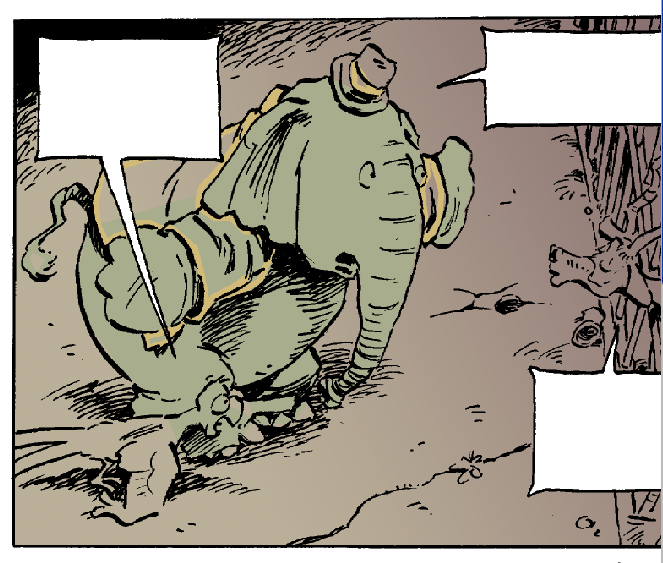
Illustration by Heinrich Kley, from the series The Family at the Sea Shore

My eyes are pinchy and I have a crick in my neck that’s reduced my arc of vision to about 90 degrees. It’s times like these that I’m glad that I made the decision early to break up this mammoth project into bite sized and varied pieces. Ten pages drawing, send them to my editor, ten pages inking, ten pages colouring, get approval on the first ten and then start the whole process over again. The relentless mathematics of doing a book has kicked in now as I find my stride. One day pencilling, a half day inking, three quarters of a day colouring adds up to four to five more months work before I reach the end of Book One.
I woke up in a cold sweat the other day from a half dream where I suddenly realized that I would be 60 by the time I’ve finished the three-book arc of this story. The relentless math had transposed into a relentless march through a good portion of my allotted time on this earth. But in the cool light of day I remembered that I had to be doing something with my time over the next decade and at the moment I’m having the time of my life.
Except when I’m colouring.
It’s not that I don’t like colouring. It’s simply the least favourite part of my work. And because I have elected to colour this on the computer, it’s also the most physically demanding. I haven’t figured out a good interface with my computer that doesn’t leave me eye sore and weary at the end of the day. But I still prefer it to colouring on my art board, enjoying the options inherent in using flat colour with Photoshop, the possibilities to play around with tones harmlessly and without consequence and to be able to create certain effects that would be difficult using paint. But it still hurts!
As I’ve mentioned in a previous blog (I think) the drawing and inking is really where my passion lies. I barely touched paint before I was thirty, and would gladly abandon it again if my work would allow. (My partner, on the other hand, loves her colour, would eat it up if she could, and in some books has been my Jack Spratt’s wife to my preferred diet of lean, clean line.) I think my love of line is the love of the immediacy of it all, that the picture takes shape with very few material intermediaries (just a pencil or pen) and not a whole lot of preparation. The line is drawn, the mind image transferred to paper, corrected, altered, completed.
With my inking, I always start with a tightly drawn pencil sketch so there are few surprises at this stage. But there is something about the transfer of the grey medium of pencil to the stark black line of ink, starting always in the upper left corner and working my way through so that I don’t smudge the ink (that being a hard lesson learned young!) that I find meditative and immensely gratifying.
I think for me drawing and inking are a fairly intellectual pursuit, using the cognitive part of my brain where I exercise a million little decisions in working through a drawing. But there is also something that is very unambiguous about ink, a finality where, if you don’t get it right, the drawing is ruined but it also doesn’t allow for the endless tinkering that paint does.
I thought I would mention a couple of books, one that was my bible for pen and ink drawing when I was working at improving my technique many years ago, and the second an artist who’s work I admire greatly. The first was originally published in 1930 – my edition is from 1976 – and I don’t know it it’s still in print. It’s titled Rendering in Pen and Ink by Arthur L. Guptill, and includes step-by-step instructions on a variety of techniques and portfolios of early 20th century ink drawings that are lessons in themselves. The second is a book of drawings by the German artist Heinrich Kley. Irreverent and sometime misogynist, they are still brilliant renderings that always inspire.
Now, back to the drawing board!


Above: One of the many inspirational pen and ink drawings from Guptill's book. This illustration is by John R. Neill.
This week's preview, p. 38 from Big City Otto. One of my favourite panels in this story is the bottom panel, where Otto is looking out over the city and realizing for the first time how big it is (and how hopeless their task of finding Georgie). I found a great old photo from the '30's of the New York skyline and used this as my inspiration for the cityscape.