Thursday, November 24, 2011

Drawing with Character Part 3:

The Practical Bit continued …


2. Thumbnails

I've spoken in previous posts about the value of thumbnails but I will repeat it here. I find the thumbnail process invaluable in character development. At this stage, unburdened yet with the encumbrances of detail, one can often capture with a few quick lines a facial or body expression that can serve as a valuable reference when you come to final pencils. Don't labour over character at this point, but equally, don't move on to the next frame until the current one has captured the essence of expression that you desire.

Here is a thumbnail I did for p. 53 of Hometown Otto. You can see how I've worked out points of view, lighting and - most importantly - the faces and body language that I want to communicate in my final. The tentative approach of the hidden animals, the wacky look on the goose, the pathetic look on the calf are all sketched in at this point.
And here is the final pencil that I completed last week. A few things have changed (for instance I have added bits of junk that the animals are emerging from), but the essence of the page is very much what I had first imagined. I will constantly consult my thumbnails as I work through my final roughs, just to make sure that I don't stray too far from those initial - and I think best - impressions.
This page also contains my favourite line in the entire book,  from Giselle the Goose, recent escapee from a paté de foie gras factory- "I've got a dodgy liver thanks to those criminals!"

Wednesday, November 9, 2011

Drawing with Character: Part 2

The Practical Bit …

Okay, picking up from the last post, once you have taken ownership of the story, inhabited the characters fully and approached your work armoured in integrity and honesty, (whatever that means!) there are a number of very practical tools in the illustrator's paint box that can help you tell the visual story you want to tell and invest its characters with, well, character.

1. Character Sketches

Whenever I begin a story, I always spend a little time doing some character sketches for the main characters. As I work fairly impetuously, often those characters come out whole cloth. Others I work through a bit more until I've got what I want.

This is a very important process and you should spend as much time as it takes at the beginning to make sure that you are comfortable with your characters. Be sure to know them in a number of different guises - surprised, angry, sad. Even in attitudes that aren't necessarily going to be used in the story, as this will help you to more fully inhabit the character and make it three dimensional (character-wise) when it comes to working on pages.

These are my character sketches for Pedro, a panther that befriends (sort of) our two heroes in Hometown Otto.  You can see how I'm working my way through this character, ditching the first couple of head sketches and getting more of a feel for him on the third try. About this time I think I actually went and took a look at what a panther looks like, flattening the forehead and raising the snout higher on the face in sketch four. I try Pedro out in a variety of expressions, trying to capture the friendly yet self-serving and somewhat shifty character that he is (and as are all cats!) You can double click on these images if you want to see them larger.

These are some character sketches I did for Snake (an evil - or at least not so good - carny). Again, you can see me working through the character, eventually returning to something closer to where I had begun. When my editor read my manuscript for Hometown Otto she thought Snake really was a snake so that was a good point of departure for this character. I made him long and sinewy, with snake skin boots and snake tattoos. The tattoos became simplified as I developed him, realizing early on that I didn't want to have to draw anything that elaborate over a multitude of pages!

I'm not shy, as an illustrator, about reaching for archetypes when I'm creating characters. A case in point would be the other day when I was sketching up some ideas for a small town sheriff for Hometown Otto. My small town sheriff archetype would have to be Rod Steiger from “In the Heat of the Night” and as  I already was working with a bit of a spoof on the movie anyway, I went to Google's Image Search and pulled up a few pictures of Rod Steiger. These then shaped the basis for my character sketches.
Not shy of reaching for archetypes, when I needed a southern U.S. small town sheriff, Rod Steiger from The Heat of the Night, came to mind.

Tuesday, October 25, 2011

Drawing with Character: Part One

The Heady Bit …
I was writing up some notes for a presentation I will be making at the Packaging Your Imagination conference in Toronto on November 5 and I thought the observations around visual character development were worth repeating here. Although this particular talk is more directed to picture book illustration, much of it applies equally well to character development in graphic novels.

So here you go!


One cannot talk about character development without talking about the story in its entirety.
As an author/illustrator ownership is obviously not an issue. But as an illustrator of someone else's story, ownership is key.

You need to remember that you are a 50% partner in the relationship, and, for the duration of your work on the project, 100% owner. Only by fully embracing the story as your own can you give it the life and verve that will come from the tip of your pencil, brush or stylus.


Think of the story as your story, the book as your book. This isn't to cut the author out of the process but rather to put yourself in a mind set that will allow you to give your very best to the story. Because at the end of the day, your responsibility isn't to the author but rather to the story itself. You as illustrator are not simply a third party mediator between author and reader but a bonafide story-teller in your own right. And your story is the drawn one.


To really portray a character effectively you need to inhabit the character fully. You need to crawl right into its skin and peer out through the eye holes. This is the case whether it is a person or dog or cat or pig or whatever. You need to move beyond thinking of the character as separate to yourself, a third party entity.

This will help not only with character development but also the drama of the story. And again, the two are inextricably linked. There is an elation in inhabiting the character. As illustrators we are blessed with the opportunity to travel through our imaginations, do things we would never dare do, all from the safety of our own desk. 

Draw on your own experiences fully in the process of this possession. This will be easier with a character that is sympathetic to your own personality but in this respect we all have to be fairly versatile actors, and usually there is something within ourselves that we can dig deep and latch on to when we put pencil to paper.

It is said that when an athlete watches a film of someone doing their sport, in their mind all the same signals are being sent out as if they were actually doing the sport themselves. Or something like that.

So we have to be the athletes of the drawing board, feeling in every fibre of our being the same thing that the character in your story is feeling. And in doing that the character will emerge.


Whatever you do with your character, stay honest to the story. If your character begins to act and react at odds to the written word then you will loose credibility to your audience and do a disservice to the author. Read the story well, and in the process of inhabiting the character make sure that the character you are inhabiting is the one that the author has written.

One of the most gratifying comments I have received is when an author says that they feel as if I have crawled into their head and put their thoughts on paper. It is not of course the author's head one crawls into, but rather the story that has sprung from that author's head.

If you try to be too clever, too sophisticated or generally start drawing with other motivations then simply to tell the story, then you are in danger of taking the visual tale somewhere that does the story discredit. 


Next time: The Practical Bit!

Monday, October 10, 2011

Launched!

We had a great send off for Otto on Saturday, October1. In the company of friends, fans and relatives Otto and Crackers set sail on the Great Graphic Sea, hopefully to populate far-flung shores with multiple copies of his book (hint, hint)!
The launch, at Titles Bookstore in Peterborough, Ontario, was replete with five (count 'em!) different kinds of peanuts, free Gator Jus and comic sampler give-a-ways. I had the pleasure of reading from Big City Otto ( I blew up the pages real good!) talking a bit about the process of creating the comic and doing a bit of sketching for my loyal fans.
And what graphic novel gathering would be complete without at least one fan arriving dressed as her favourite character!
Otto fan in costume.

Doing what I do best.


How to read from a comic 101.
One of the best parts about doing a book!

Friday, September 2, 2011

Big City Otto Book Launch!

On Saturday, October 1, 2011 from 2 to 3 p.m. I will be launching Big City Otto at Titles Bookstore, 379 George St. N., Peterborough, Ontario. This will be part of the Culture Days events in Peterborough, and will include drawing demonstrations, Q & A, free peanut-related refreshments, spot prizes and give-aways. I hope you can join me.


"Slavin’s illustrations recall latter-day Will Eisner for the urban realism, rumpled figures, and the appealing personalities he packs into the large cast of quirky human and animal characters." - Booklist


Wednesday, June 29, 2011

Drawing Birdy

So I'm back at my drawing board this week. After a two month hiatus between thumbnailing my new Otto book and beginning the pencil roughs, I'm once again splashing about in the balmy waters of pencildom, happy as a duck.
As I was sketching out an early sequence in the book (shown below) I began thinking about this character Birdy and where she came from. Like authors, story illustrators find their affection growing for certain characters as they work them through, and for me Birdy is one of those. Motherly and kind, she brings our heroes in out of a nasty downpour and brews them up a nice cup of tea. They end up staying the night in her cozy little caboose in an abandoned railyard, and when they prepare to leave the next day, she is talked into joining them on their travels.
But where did this character Birdy come from? It was only when I was sketching her up for the third or fourth panel that it suddenly occurred to me she was a little old Scottish lady I ran into in England's Lake District. Thirty years ago.
The story goes like this. My partner of the time and I had just stepped off our bus in a small Cumbrian village, and were standing staring about, probably looking somewhat lost, when a little voice near my left elbow asked us where we were staying. I discovered the voice's source, a little old wizened gnome in rubber boots and Macintosh, with a load of firewood in her arms, and told her we had no idea. To which she answered, "Well, come along then," and turned and started hoofing it across a field. We grabbed our heavy packs and scrambled to keep up with her as she nimbly hopped over a downed fence, with no idea where she was taking us. Eventually we ended up at her B&B. 
It was along time ago, as I say, but my memory of her is still fresh as the day it happened — her mater-of-fact taking us under wing, the old saggy four poster bed heaped with comforters and replete with hot water bottle. And especially the mountain of food she piled up for us for breakfast. And I remember her telling us her story, how she was "brought South" by an English lad when she was a young girl, lured across the border by young love, by a husband who had had the audacity to up and die and leave her alone away from family.
And it was today that I realized that that is who Birdy is, that I'd drawn a tribute to a long-forgotten memory. But in this story, because it's mine to do with as I please, this time she goes home.

Otto and Crackers meet Birdy on a wet night. My unconcious tribute to
a little old Scottish lady I met thirty years ago.

Wednesday, June 8, 2011

"How to Draw Otto" Videos

Lately I've been messing around with creating a "How to Draw Otto" video. I ended up with two, a short, speeded up version:


And a longer, guided tutorial version:


Let me know if you like them. I will be posting them (hopefully along with others in the future) on their own "How to Draw" page, accessible through the Pages bar above.
Enjoy!

Tuesday, May 31, 2011

Very excited …

I just received news today that advance copies of Big City Otto are now in at my publishers. For the uninitiated, these copies are those sent ahead of the slow boat from China (or wherever the books are being printed - but probably China) to be sent to reviewers, bloggers and persons of influence. If I'm lucky I might even get one myself!
As the book gets closer to its release date the publicity and promotional machine begins to go into high gear. In addition to the sampler that I mentioned in my last post, I also have a stack of promotional post cards in my hot little hands to distribute to the four winds.
And if you really can't wait for the book, here is a link to a 16 page preview that Kids Can has posted on their web site. (Just click on the image below.)

Enjoy!

Click on image to go to preview.

Wednesday, March 23, 2011

Bits and Pieces


Here are a few bits and pieces I'm working on these days as I wait around for my editor to get back to me with comments on the second book in the Elephants Never Forget series (Hometown Otto).
Here's a self-portrait I was asked to do, to be included in a promotional sampler
of Kids Can's fall graphic novels. It will also have a few spreads from Big City Otto,
so keep your eyes peeled for it!


Above: Some first round character sketches for Birdy, a retired dancing bear
that helps get Otto and Crackers pointed in the right direction. There are a lot more
characters in the second book, and I want to start to get a feel for them before
 I get into the actual thumbnailing of the story.
Below: Sketches for Harriett Tubby, a pig that our heroes meet who is running an underground
railroad escape route for mistreated farm animals. She is based on the remarkable Harriett Tubman,
who was famously pictured with gun in hand as she led escaped slaves north to freedom. A the moment
I have opted for a broom, but that may change. Any suggestions?

Thursday, February 3, 2011

Wrapping It Up

This week I was finishing the last bits and pieces of the graphic novel – title page, end papers and cover. It all went down to the publisher’s yesterday and this morning I woke up unemployed!

As we all know, you must, MUST not judge a book by the cover. But yet, as an illustrator, I know how important it is to get the book cover as right as possible. This will be the reader’s first encounter, and along with a brief  flip through and perusal of the jacket copy, will be the deciding factor as to whether your book gets read.

Whenever I do a book, I always prefer, if possible, to do the book cover last. By then I’ve had time to think about the book, what it’s about, what its essence is, and hopefully, have some ideas that can be distilled down to something that is eye-catching and, more importantly, captures the story.

When we were kids I think we were all frustrated by covers that were clearly done by someone who hadn’t read the story – small details that we knew were just dead wrong. But it doesn’t mean that the illustrator can’t stray from the text a bit because, as a cover, you’re not simply reflecting a part of the story, but rather something that is emblematic of the entire story. Also, there needs to be a tie in with the title, so that the title and cover image make sense as a whole. So what ends up on the cover might be a particular scene that captures the essence or it might be a constructed scene that doesn’t actually appear in the book itself.

Finally, the cover is something that most publishers are pretty hands on with. They may let you run fast and foot loose in the interior of the book, but when it comes to covers they will want their say. This can lead to multiple versions or, if you’re lucky or inspired, you may nail it on the first go.

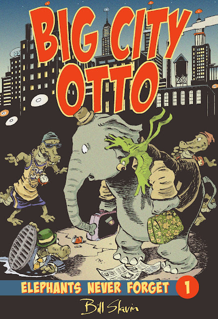
Below are the three versions of the Big City Otto cover that I went through, along with the final art. I’m happy with where the cover ended up, and feel that it is a fairly good representation of what you will find between the covers.

Here is my first quick sketch for the cover, executed a few months ago. I wanted to communicate  a "lost in America" feel, hence Otto with suitcases, looking like a newly arrived immigrant 40's style straight off the boat. And as the Alligari Boys feature prominently in the story, I wanted to include them in a menacing role. I elected to go with an all black background with a single pool of light, trying to give the whole thing a film noire retro look.


My editor Tara Walker came back to me with the comments that although she liked it, she felt that it didn't really say "Big City".  She suggested some buildings in the background. In the meantime I had begun to think that the first one wasn't animated enough and that it might be fun to show the scene immediately after Otto had unwittingly helped the Alligari Boys knock over a convenience store. I've taken the title copy to a more finished state, distorting the Baddaboom typeface that I had used in the interior for sound effects and loud shouting. I've also dropped Esperanca's name off the cover (by mutual consent!) as her involvement in other book work had taken her away from a major role in this project (she still gets a writing credit on the title page). I liked the hand-lettered effect for my name, which I had first used in the title bar of this blog, so I went with that, and added a city skyline in the background  to communicate "Big City".

Here's the third go around. Again, Tara was encouraging (as editors have to be!) but said that she felt that the second attempt didn't really focus in very effectively on Otto and that she preferred my first take but with more city. I could see her point, and took another look at this to see how I could incorporate that. It occurred to me that if I flattened out the perspective a bit and went to solid black for the mid-ground, I could make the somewhat tricky transition from a three quarter bird's eye view in the foreground to looking up at the city skyline in the background. I also thought it would be fun to actually have Big Al emerging from the sewer hole to reinforce the "alligators in the sewers" theme that runs through the second half of the book. (You will notice that Big Al's cigar has disappeared in the second and third versions. Smoking on the cover, even by a bad guy who's height has clearly been compromised by this activity, was an absolute no-go.)
And here is the final go. Tara circulated the third pencil around Kids Can Press and it received enthusiastic approval, with the only concern being that too much of the title was obscured by Otto - an easy fix.
I'm really happy with the retro feel of this, the contrast of the red type against the black background. Synchronicity even played a part as I had accidentally added a coarser dither to the colour in Photoshop, but realised that I liked the effect, which mimicked the coarser colour screens of earlier printing processes.
In the end I think the cover has accomplished exactly what a cover needs to do. It right away says "Big City" in both name and image, reflects one of the major dynamics of the story (the interaction between Otto and the Alligari Boys), and shows Otto as a bit at sea and innocent in a foreign environment. This was one of those covers that doesn't show an actual scene in the story, but captures its essence. And it was truly a collaborative work between my editor Tara and myself, who's sage comments helped lead me to exactly where I think this book cover should be.

Friday, January 14, 2011

Done!

Spoiler Alert! As you can see by the final panel of Big City Otto,
neither of the principle characters is knocked off in
Book One.
Not to say it isn't touch and go at times!


I coloured the last of eighty pages yesterday. That’s eleven months of steady work doing the final art, almost three years of planning, months of thumbnails and editing. Or, to put it in a more visual way…


Not that it’s all done. I have a cover still to work out, and a title page, and text and art have to be married in InDesign. Things need to be proofed and corrected. But as of today, the book, for all intents and purposes, is done.
Looking at the stack of boards that comprise the inked portion of a project this size, I find it’s a formidable pile of art. When I go to schools and speak to the kids, this is something I always do, show them the physical evidence, the stack of thumbnails, pencil roughs and final art that comprise this thing we call a book. Try to make it real for them. Because for a lot of kids, and adults, too, they’ve never really made that connection between the labour involved, the creation of art, and how that translates into a pile of paintings.
There will never be a coloured version of this book to show kids, at least not as finished art. And I think, as I now struggle to find the room in my ever dwindling studio for yet another stack of art, that a lot of young illustrators and those of my generation who have made the switch to digital don’t have to deal with this space issue. They also won’t have that stack of art to show aspiring artists, that opportunity to wow them with the sheer volume of what you have produced, and in a way, I think that’s too bad. In fact, as more and more books are delivered digitally, that physical manifestation of the artist’s work continues to dwindle. And I wonder, when there is no original art anymore, no books as we have known them, how will we continue to value something that has become so abstracted? But maybe I worry too much.
In the meantime, I’m going to revel in the pleasure of a job well done, and start to ruminate about Book 2 in the Otto and Crackers saga. And on the upside, as my sister in Saskatoon has helpfully suggested, “Esperança will be glad to see the end of this project too so you don't have to make elephant jokes together all the time.” At least not for a while!

Available now while quantities last! Your very own Otto bookmark. Lovingly printed on Coated Two-side 90 lb. Cover Stock and accepted as legal tender in Pugganooga, this remarkable piece of memorabilia can be yours for only
$19.95 (+ shipping and handling) 


Offer not valid in Pugganooga.