
Okay, kids, time for a tutorial. But before I get started, I just want everyone to know that I'm no expert. But I do have one golden rule, and if you can remember this then ninety percent of your grief will be solved.
Golden Rule #1: If you can't do what you want to do, you are either:
A On the wrong layer or, more likely …
B Have something selected somewhere. Hit deselect and try again.
Unlike many of my younger brethern and sistern who have had computer art hard-wired into them along with their mother's milk, I had to learn the difficult way. I started out colouring on the ICON computer (a footnote in government attempts to develop a made-in-Canada computer industry back in the late 80's) with a palette of four colours at my disposal. Eventually this increased to 16 (oh, the liberty!) It was pre-scanners and the screen resolution was about one pixel to the inch.
My preference has typically been to do my art on my board since then, so my knowledge of Photoshop pretty well begins and ends with what I need to know to colour my comics. But I have developed a system that works well for me (I can colour about two pages on a good day) and I really do prefer the computer for colouring comic art as it adapts well to flat colour, allows me to play around with some graduated screen effects that would be difficult to achieve on my art board, and the undo lets me experiment with colour with impunity.
I've done a series of screen captures as my work progressed, and I will comment on these in the captions below each image.

Here is my working desktop, with swatch and layer palettes out. I've imported the scanned-in ink line work which I've done on my art table and cleaned up in Photoshop. The scanned text has been removed (I glue on blocks of text at the rough stage to determine balloon sizes) but in this case I have kept it on a hidden layer (line copy) so I can place it for the final screen shot.
My layers are always organized this way and the names are pretty well self-explanatory (Whoosh! is the special effects layer). All are transparent with Line at the top so that no colour covers it up, and a White layer on the bottom to rid myself of the checkerboard pattern in transparencies.
The Swatch palette has a number of preset colours, many dedicated to Otto and Crackers to maintain colour consistency throughout.

I begin by blocking in my backgrounds. This is a nice chance to introduce some gradated blocks of colour to add mood and ambience to what will mostly be flat coloured art. This scene is at night so I have elected to go with a subdued, nighttime-like palette.
Next I block in colour on my Colour layer. It can be seen in the above image that this mostly consists of outlining the areas that I wish to fill and then using the fill tool. The beauty of using layers is that the underlying colour does not interfere with what you do on this layer, and any mistakes in filling can easily be erased without damaging your background.

Here is the page with all of the colour now blocked in. I'm not worrying about any sort of shading at this point. You will also notice that I have introduced a second background layer. This is because I realized, as the colouring progressed, that there were some more shading effects that I wanted to bring to the background and it was simpler to work on a higher layer to do this.

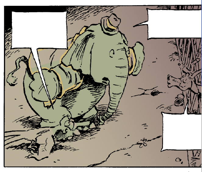
And here is the final page. Shadows and highlights have been layered on in the Colour layer, mostly by the simple expedient of selecting the colour throughout (say, Otto's coat) and then using a big fat pencil to block in shadows without worrying about spilling over into other colours. Small effects are brushed in on the Whoosh! layer, edges cleaned up, and then the scanned text reintroduced (in actuality this text will be placed via InDesign, but it gives a better sense of the final page with it in place).
And that's everything I know about Photoshop.