Showing posts with label process. Show all posts

Wednesday, November 9, 2011

Drawing with Character: Part 2

The Practical Bit …

Okay, picking up from the last post, once you have taken ownership of the story, inhabited the characters fully and approached your work armoured in integrity and honesty, (whatever that means!) there are a number of very practical tools in the illustrator's paint box that can help you tell the visual story you want to tell and invest its characters with, well, character.

1. Character Sketches

Whenever I begin a story, I always spend a little time doing some character sketches for the main characters. As I work fairly impetuously, often those characters come out whole cloth. Others I work through a bit more until I've got what I want.

This is a very important process and you should spend as much time as it takes at the beginning to make sure that you are comfortable with your characters. Be sure to know them in a number of different guises - surprised, angry, sad. Even in attitudes that aren't necessarily going to be used in the story, as this will help you to more fully inhabit the character and make it three dimensional (character-wise) when it comes to working on pages.

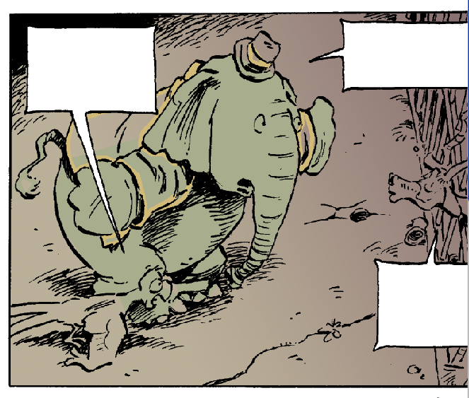
These are my character sketches for Pedro, a panther that befriends (sort of) our two heroes in Hometown Otto.  You can see how I'm working my way through this character, ditching the first couple of head sketches and getting more of a feel for him on the third try. About this time I think I actually went and took a look at what a panther looks like, flattening the forehead and raising the snout higher on the face in sketch four. I try Pedro out in a variety of expressions, trying to capture the friendly yet self-serving and somewhat shifty character that he is (and as are all cats!) You can double click on these images if you want to see them larger.

These are some character sketches I did for Snake (an evil - or at least not so good - carny). Again, you can see me working through the character, eventually returning to something closer to where I had begun. When my editor read my manuscript for Hometown Otto she thought Snake really was a snake so that was a good point of departure for this character. I made him long and sinewy, with snake skin boots and snake tattoos. The tattoos became simplified as I developed him, realizing early on that I didn't want to have to draw anything that elaborate over a multitude of pages!

I'm not shy, as an illustrator, about reaching for archetypes when I'm creating characters. A case in point would be the other day when I was sketching up some ideas for a small town sheriff for Hometown Otto. My small town sheriff archetype would have to be Rod Steiger from “In the Heat of the Night” and as  I already was working with a bit of a spoof on the movie anyway, I went to Google's Image Search and pulled up a few pictures of Rod Steiger. These then shaped the basis for my character sketches.
Not shy of reaching for archetypes, when I needed a southern U.S. small town sheriff, Rod Steiger from The Heat of the Night, came to mind.

Tuesday, October 25, 2011

Drawing with Character: Part One

The Heady Bit …
I was writing up some notes for a presentation I will be making at the Packaging Your Imagination conference in Toronto on November 5 and I thought the observations around visual character development were worth repeating here. Although this particular talk is more directed to picture book illustration, much of it applies equally well to character development in graphic novels.

So here you go!


One cannot talk about character development without talking about the story in its entirety.
As an author/illustrator ownership is obviously not an issue. But as an illustrator of someone else's story, ownership is key.

You need to remember that you are a 50% partner in the relationship, and, for the duration of your work on the project, 100% owner. Only by fully embracing the story as your own can you give it the life and verve that will come from the tip of your pencil, brush or stylus.


Think of the story as your story, the book as your book. This isn't to cut the author out of the process but rather to put yourself in a mind set that will allow you to give your very best to the story. Because at the end of the day, your responsibility isn't to the author but rather to the story itself. You as illustrator are not simply a third party mediator between author and reader but a bonafide story-teller in your own right. And your story is the drawn one.


To really portray a character effectively you need to inhabit the character fully. You need to crawl right into its skin and peer out through the eye holes. This is the case whether it is a person or dog or cat or pig or whatever. You need to move beyond thinking of the character as separate to yourself, a third party entity.

This will help not only with character development but also the drama of the story. And again, the two are inextricably linked. There is an elation in inhabiting the character. As illustrators we are blessed with the opportunity to travel through our imaginations, do things we would never dare do, all from the safety of our own desk. 

Draw on your own experiences fully in the process of this possession. This will be easier with a character that is sympathetic to your own personality but in this respect we all have to be fairly versatile actors, and usually there is something within ourselves that we can dig deep and latch on to when we put pencil to paper.

It is said that when an athlete watches a film of someone doing their sport, in their mind all the same signals are being sent out as if they were actually doing the sport themselves. Or something like that.

So we have to be the athletes of the drawing board, feeling in every fibre of our being the same thing that the character in your story is feeling. And in doing that the character will emerge.


Whatever you do with your character, stay honest to the story. If your character begins to act and react at odds to the written word then you will loose credibility to your audience and do a disservice to the author. Read the story well, and in the process of inhabiting the character make sure that the character you are inhabiting is the one that the author has written.

One of the most gratifying comments I have received is when an author says that they feel as if I have crawled into their head and put their thoughts on paper. It is not of course the author's head one crawls into, but rather the story that has sprung from that author's head.

If you try to be too clever, too sophisticated or generally start drawing with other motivations then simply to tell the story, then you are in danger of taking the visual tale somewhere that does the story discredit. 


Next time: The Practical Bit!

Wednesday, March 23, 2011

Bits and Pieces


Here are a few bits and pieces I'm working on these days as I wait around for my editor to get back to me with comments on the second book in the Elephants Never Forget series (Hometown Otto).
Here's a self-portrait I was asked to do, to be included in a promotional sampler
of Kids Can's fall graphic novels. It will also have a few spreads from Big City Otto,
so keep your eyes peeled for it!


Above: Some first round character sketches for Birdy, a retired dancing bear
that helps get Otto and Crackers pointed in the right direction. There are a lot more
characters in the second book, and I want to start to get a feel for them before
 I get into the actual thumbnailing of the story.
Below: Sketches for Harriett Tubby, a pig that our heroes meet who is running an underground
railroad escape route for mistreated farm animals. She is based on the remarkable Harriett Tubman,
who was famously pictured with gun in hand as she led escaped slaves north to freedom. A the moment
I have opted for a broom, but that may change. Any suggestions?

Thursday, February 3, 2011

Wrapping It Up

This week I was finishing the last bits and pieces of the graphic novel – title page, end papers and cover. It all went down to the publisher’s yesterday and this morning I woke up unemployed!

As we all know, you must, MUST not judge a book by the cover. But yet, as an illustrator, I know how important it is to get the book cover as right as possible. This will be the reader’s first encounter, and along with a brief  flip through and perusal of the jacket copy, will be the deciding factor as to whether your book gets read.

Whenever I do a book, I always prefer, if possible, to do the book cover last. By then I’ve had time to think about the book, what it’s about, what its essence is, and hopefully, have some ideas that can be distilled down to something that is eye-catching and, more importantly, captures the story.

When we were kids I think we were all frustrated by covers that were clearly done by someone who hadn’t read the story – small details that we knew were just dead wrong. But it doesn’t mean that the illustrator can’t stray from the text a bit because, as a cover, you’re not simply reflecting a part of the story, but rather something that is emblematic of the entire story. Also, there needs to be a tie in with the title, so that the title and cover image make sense as a whole. So what ends up on the cover might be a particular scene that captures the essence or it might be a constructed scene that doesn’t actually appear in the book itself.

Finally, the cover is something that most publishers are pretty hands on with. They may let you run fast and foot loose in the interior of the book, but when it comes to covers they will want their say. This can lead to multiple versions or, if you’re lucky or inspired, you may nail it on the first go.

Below are the three versions of the Big City Otto cover that I went through, along with the final art. I’m happy with where the cover ended up, and feel that it is a fairly good representation of what you will find between the covers.

Here is my first quick sketch for the cover, executed a few months ago. I wanted to communicate  a "lost in America" feel, hence Otto with suitcases, looking like a newly arrived immigrant 40's style straight off the boat. And as the Alligari Boys feature prominently in the story, I wanted to include them in a menacing role. I elected to go with an all black background with a single pool of light, trying to give the whole thing a film noire retro look.


My editor Tara Walker came back to me with the comments that although she liked it, she felt that it didn't really say "Big City".  She suggested some buildings in the background. In the meantime I had begun to think that the first one wasn't animated enough and that it might be fun to show the scene immediately after Otto had unwittingly helped the Alligari Boys knock over a convenience store. I've taken the title copy to a more finished state, distorting the Baddaboom typeface that I had used in the interior for sound effects and loud shouting. I've also dropped Esperanca's name off the cover (by mutual consent!) as her involvement in other book work had taken her away from a major role in this project (she still gets a writing credit on the title page). I liked the hand-lettered effect for my name, which I had first used in the title bar of this blog, so I went with that, and added a city skyline in the background  to communicate "Big City".

Here's the third go around. Again, Tara was encouraging (as editors have to be!) but said that she felt that the second attempt didn't really focus in very effectively on Otto and that she preferred my first take but with more city. I could see her point, and took another look at this to see how I could incorporate that. It occurred to me that if I flattened out the perspective a bit and went to solid black for the mid-ground, I could make the somewhat tricky transition from a three quarter bird's eye view in the foreground to looking up at the city skyline in the background. I also thought it would be fun to actually have Big Al emerging from the sewer hole to reinforce the "alligators in the sewers" theme that runs through the second half of the book. (You will notice that Big Al's cigar has disappeared in the second and third versions. Smoking on the cover, even by a bad guy who's height has clearly been compromised by this activity, was an absolute no-go.)
And here is the final go. Tara circulated the third pencil around Kids Can Press and it received enthusiastic approval, with the only concern being that too much of the title was obscured by Otto - an easy fix.
I'm really happy with the retro feel of this, the contrast of the red type against the black background. Synchronicity even played a part as I had accidentally added a coarser dither to the colour in Photoshop, but realised that I liked the effect, which mimicked the coarser colour screens of earlier printing processes.
In the end I think the cover has accomplished exactly what a cover needs to do. It right away says "Big City" in both name and image, reflects one of the major dynamics of the story (the interaction between Otto and the Alligari Boys), and shows Otto as a bit at sea and innocent in a foreign environment. This was one of those covers that doesn't show an actual scene in the story, but captures its essence. And it was truly a collaborative work between my editor Tara and myself, who's sage comments helped lead me to exactly where I think this book cover should be.

Friday, January 14, 2011

Done!

Spoiler Alert! As you can see by the final panel of Big City Otto,
neither of the principle characters is knocked off in
Book One.
Not to say it isn't touch and go at times!


I coloured the last of eighty pages yesterday. That’s eleven months of steady work doing the final art, almost three years of planning, months of thumbnails and editing. Or, to put it in a more visual way…


Not that it’s all done. I have a cover still to work out, and a title page, and text and art have to be married in InDesign. Things need to be proofed and corrected. But as of today, the book, for all intents and purposes, is done.
Looking at the stack of boards that comprise the inked portion of a project this size, I find it’s a formidable pile of art. When I go to schools and speak to the kids, this is something I always do, show them the physical evidence, the stack of thumbnails, pencil roughs and final art that comprise this thing we call a book. Try to make it real for them. Because for a lot of kids, and adults, too, they’ve never really made that connection between the labour involved, the creation of art, and how that translates into a pile of paintings.
There will never be a coloured version of this book to show kids, at least not as finished art. And I think, as I now struggle to find the room in my ever dwindling studio for yet another stack of art, that a lot of young illustrators and those of my generation who have made the switch to digital don’t have to deal with this space issue. They also won’t have that stack of art to show aspiring artists, that opportunity to wow them with the sheer volume of what you have produced, and in a way, I think that’s too bad. In fact, as more and more books are delivered digitally, that physical manifestation of the artist’s work continues to dwindle. And I wonder, when there is no original art anymore, no books as we have known them, how will we continue to value something that has become so abstracted? But maybe I worry too much.
In the meantime, I’m going to revel in the pleasure of a job well done, and start to ruminate about Book 2 in the Otto and Crackers saga. And on the upside, as my sister in Saskatoon has helpfully suggested, “Esperança will be glad to see the end of this project too so you don't have to make elephant jokes together all the time.” At least not for a while!

Available now while quantities last! Your very own Otto bookmark. Lovingly printed on Coated Two-side 90 lb. Cover Stock and accepted as legal tender in Pugganooga, this remarkable piece of memorabilia can be yours for only
$19.95 (+ shipping and handling) 


Offer not valid in Pugganooga.

Tuesday, October 19, 2010

Elephant Thumbnails


Above you can see the thumbnail and subsequent pencil rough for p. 62 of Big City Otto. I'm constantly referring to my original sketch in order to capture the spontaneity and energy as I work on my finished pencils.

In my on-going education and elucidation, I can say, unequivocally, that elephants do not have thumbnails. Toenails, yes, and lovely ones at that, but the lack of thumbnails is inexorably hinged to the lack of thumbs which creates no end of troubles for an illustrator who needs his elephant to, well, hold things. But that remains for a future post – the visual pitfalls of anthropomorphism!

In talking about storyboarding, or thumbnails, I’m really reaching into the vault here, as this was a process started over two years ago. Much of the original storyboarding for Big City Otto (book one of Elephants Never Forget) was done on a trip to the Azores, my partner Esperança’s birth place, in the summer of 2008. It was a memorable trip for the fact that most of my two-week stay on those beautiful islands was spent in the hospital waiting room, while Esperança attended to her mother who had become quite ill a few days after our arrival. Fortunately I had the Otto manuscript and my sketchbook in hand, and the visual story just poured forth over that time and the weeks following when I returned home. I remember it as a golden summer spent sitting and drawing on my back porch while the weather held. It was a very creative time, working with nothing more than pencil and sketchbook, liberated from art table and computer screen, and really just letting the creative juices flow. It was the cliché of the artist’s life and so far from the reality of what it usually takes to make a living as an illustrator.

The months of work spent on those thumbnails was all speculative work, something that is familiar to the writer but less so to the illustrator who usually has contract in hand before pencil goes to paper. But the fruit of those days’ labour was a fully-realized manuscript complete with sketches, and I honestly believe that this lead to the subsequent acceptance of the story for publication.

When I speak of thumbnails here I’m really referring to the art of storyboarding, or getting the story down in small simple quick sketches. It is at this stage that I’m working out points of view, lights and darks, where the text will likely fall and how the action will be communicated over how many panels of storytelling. The thumbnailing is always the most creative part, in my view, of the entire process, a chance to tackle the bare bones of the visual narrative without getting hung up searching for references or fine-tuning the drawings. That all comes later, once I settle into the pencil roughs, many of which I’ve reproduced previously here in the posts of this blog.

But the thumbnails are really the heart of the whole thing. It is where I get my hands deep into the clay of storytelling, and in those thumbnails lies the energy and compositions for my later drawings. I refer constantly to these small sketches as I work on my pencil roughs. When I stray too far from those original imaginings the picture starts to loose its energy, gestures become wrong, angles of view too acute. So I constantly find myself returning to those very first spontaneous sketches to bring myself back on track, to those sketches that will serve as a road map for the months and months of hard work that still lie ahead. 

Sunday, October 10, 2010

Toilet Humour and Brainstorming Otto

Above is the pencil rough for Page 36, part of the scene described below. One of the wonderful things about doing comics is that the usual restrictions of reality aren't a hindrance. This means it's completely acceptable for an elephant to be stuffed into a port-a-potty and then hoisted to the top of a high-rise. In fact, not only acceptable but actually rather funny.

I’ve talked a little bit in an earlier post about how the idea of Otto originally emerged (http://www.billslavin.com/2010/07/star-is-born-imagining-otto_9811.html) but thought some of my readers might be interested in the brainstorming process that leads to ideas getting organized and on paper.

Most of the first book of Elephants Never Forget was written episodically. That is to say, once the arc of the story had been established ( Otto and Cracker's journey to America in search of Otto’s kidnapped pal, Georgie the chimp) most of the rest of the story was constructed from a series of scene ideas. These ideas usually came up and were fleshed out in brainstorming sessions conducted during regular evening walks with my partner Esperança Melo. Most of the best ideas were Esperança’s and would usually come from a conversation that went something like this:

Me: So, Otto and Crackers find themselves adrift in this huge metropolis, looking for his pal Georgie. What happens next?
E: Otto might get stuffed in a Porto-Potty.
Me: What?!!
E: A Porto-Potty.
Me: (dense) Why a Porto-Potty?
E: Well, he’s in the city and he has to go to the bathroom somewhere, and an elephant in a Porto-Potty is funny.
Me: (thinking now this isn’t such a whacky idea) Okay. Poop humour is funny. But why would there be a Porto-Potty?
E: Well maybe it’s on a construction site.
Me: (more enthusiastically) Yeah. And maybe he has to go to the bathroom because he ate a box of prunes or something.
E: That would have happened sometime sooner.
Me: Sure, like when Otto and Crackers first arrived in the city. Remember, he was hungry the whole time on the airplane and on the baggage carousel, so he may have done something ill-considered like eat a box of prunes. Maybe from an early morning delivery van when they first get into the city proper.
E: (still with the Port-a-Potty) It would be funny if the Port-a-Potty is being lifted up on a platform by a crane …
Me: What??!!
E: It would just be funnier if it all happened while being suspended from a crane.
Me: (hesitantly) Oookay. That might work. Sort of a Buster Keaton high-wire act?
E: Exactly,
Me: (gears churning) And actually that could work quite well, because once he gets out of the Port-a-Potty he would be way up in the air, and maybe for the first time gets a glimpse of how huge the city is! Like a great concrete jungle – an obvious metaphor for an elephant, don’t you think?
E: (uninterested in my elephant metaphors) Sure. Whatever. And maybe he sees an organ grinder and his monkey below in the street and thinks that it’s Georgie.
Me: That could work.
E: It would be really funny if he ran into a monkey on the street who was part of a flea circus.
Me: What??!!!

This is typical of our collaboration around the writing, with Esperança coming up with the wackier and more original ideas, forcing me to then think out of the box. Then I run with it, taking all the good stuff, writing up the scene descriptions and dialogue and figuring out how it fits into the narrative as a whole.

There are many ways of writing for a graphic novel, some highly descriptive, others sketching things out in the broadest strokes possible. Because I have the luxury of being both lead writer and illustrator, my scenes and even panel breakdowns can be fairly loose allowing me to fill in the details later. I will speak more about this in another post on storyboarding the book.

At any rate, all of the discussion on our walk (other than the flea circus bit, which made no sense whatsoever!) led to this written scene:

High Wire Scene

Panel
Caption: Hours later …
Scene: Otto and Crackers walking down the street despondently.
Crackers: Cripes! We’ve been searching for ages!
Otto: I gotta go.

Crackers: Go? Now? We just flew 3000 miles to get here and you gotta go?

Otto: No, I mean go! You know–
Crackers: Ah, jeez! This ain’t the jungle, Otto. You can’t just go anywhere.

Scene: Now walking past construction site. There’s a Johnny-on-the-spot present. A construction worker has just left it, buttoning his pants and whistling.
Crackers: See that little house? You go there.
Otto: It seems a bit small …

Scene: Otto trying to get through doorway. Crackers pushing from behind, head under Otto’s behind.
Otto: It would be much easier if I could just-
Crackers: Don’t even think about it!

Scene:
Otto is now inside. Crackers is pacing out front, with back to toilet. A crane is lifting a chain that is attached to the four corners of a skid that the toilet is standing on.
Crackers: Just let me know when you’re done.
Otto: Okee-Dokee.

Scene: The toilet is now lifting up. Crackers still has his back to it.
Otto: I’m feeling much lighter.
Crackers: Just hurry up, would ya?

Scene: Crackers is still facing away then turns, doing classic double take. The toilet is gone.
Crackers: I told you not to eat all those- Whaaa-?!!

Scene: From below, Crackers (in shadow) looking up startled as a sky crane hoists the platform with the toilet up into the air, towards the top of a skyscraper under construction.
Crackers: Otto!

Scene: Crackers chasing after platform. Otto still inside.
Crackers: Otto! Otto!
Otto: I’m coming! Just a minute!

Scene: Crackers now fluttering outside door. (Flush! coming from toilet.)
Crackers: No, Otto! This is bad! You gotta get outta there!

Scene: Door opens. Otto steps out.
Otto: So what’s the -

Scene: Otto jumps back, hugging toilet. Toilet tilts on platform.
Otto: Aaargh!

Scene: Toilet tumbles off of platform. Otto is following it, flailing, but Crackers has grabbed him by the tail.
Otto: Aieee!

Scene: Otto is pulled back onto platform, and grabs chain, shaking. Platform is tilted dangerously to one side.
Crackers: Steady, big boy. Steady. Just make your way over to the middle here …

Scene: Otto has made his way to the center of the platform. He’s looking out on the panorama of the city below.
Otto: It’s huge! Like a massive jungle, but made out of- umm …
Crackers: Concrete?

Scene: Close up of Otto. We can see a tear in his eye. Crackers looks on with concern.
Otto: Sniff! We’re never going to find Georgie, are we, Crackers?
Crackers: Sure we will, big buddy.

Otto:(Crying inconsolably) No we won’t! It’s hopeless! Boo hoo hoo!
Crackers: Easy, big fella. You gotta get a grip.

Scene: Otto suddenly wiping away tears, pointing excitedly at a tiny figure below. The whole platform tilts dangerously again.
Otto: Wait! I see him! There!
Crackers: Where?


Friday, September 24, 2010

How to Colour Otto or Everything I Know about Photoshop

Okay, kids, time for a tutorial. But before I get started, I just want everyone to know that I'm no expert. But I do have one golden rule, and if you can remember this then ninety percent of your grief will be solved.
Golden Rule #1: If you can't do what you want to do, you are either:
A On the wrong layer or, more likely …
B Have something selected somewhere. Hit deselect and try again.

Unlike many of my younger brethern and sistern who have had computer art hard-wired into them along with their mother's milk, I had to learn the difficult way. I started out colouring on the ICON computer (a footnote in government attempts to develop a made-in-Canada computer industry back in the late 80's) with a palette of four colours at my disposal. Eventually this increased to 16 (oh, the liberty!) It was pre-scanners and the screen resolution was about one pixel to the inch.
My preference has typically been to do my art on my board since then, so my knowledge of Photoshop pretty well begins and ends with what I need to know to colour my comics. But I have developed a system that works well for me (I can colour about two pages on a good day) and I really do prefer the computer for colouring comic art as it adapts well to flat colour, allows me to play around with some graduated screen effects that would be difficult to achieve on my art board, and the undo lets me experiment with colour with impunity.
I've done a series of screen captures as my work progressed, and I will comment on these in the captions below each image.
Here is my working desktop, with swatch and layer palettes out. I've imported the scanned-in ink line work which I've done on my art table and cleaned up in Photoshop. The scanned text has been removed (I glue on blocks of text at the rough stage to determine balloon sizes) but in this case I have kept it on a hidden layer (line copy) so I can place it for the final screen shot.

My layers are always organized this way and the names are pretty well self-explanatory (Whoosh! is the special effects layer). All are transparent with Line at the top so that no colour covers it up, and a White layer on the bottom to rid myself of the checkerboard pattern in transparencies.
The Swatch palette has a number of preset colours, many dedicated to Otto and Crackers to maintain colour consistency throughout.

I begin by blocking in my backgrounds. This is a nice chance to introduce some gradated blocks of colour to add mood and ambience to what will mostly be flat coloured art. This scene is at night so I have elected to go with a subdued, nighttime-like palette.

Next I block in colour on my Colour layer. It can be seen in the above image that this mostly consists of outlining the areas that I wish to fill and then using the fill tool. The beauty of using layers is that the underlying colour does not interfere with what you do on this layer, and any mistakes in filling can easily be erased without damaging your background.

Here is the page with all of the colour now blocked in. I'm not worrying about any sort of shading at this point. You will also notice that I have introduced a second background layer. This is because I realized, as the colouring progressed, that there were some more shading effects that I wanted to bring to the background and it was simpler to work on a higher layer to do this.

And here is the final page. Shadows and highlights have been layered on in the Colour layer, mostly by the simple expedient of selecting the colour throughout (say, Otto's coat) and then using a big fat pencil to block in shadows without worrying about spilling over into other colours. Small effects are brushed in on the Whoosh! layer, edges cleaned up, and then the scanned text reintroduced (in actuality this text will be placed via InDesign, but it gives a better sense of the final page with it in place).

And that's everything I know about Photoshop.


Tuesday, September 7, 2010

Alligata Gangstas

Pencil rough for p. 56, where we meet Shorty Pants.

Sometimes things just seem to arrive as a gift from heaven.

I knew from the first that sooner or later Otto and Crackers would tangle with some alligator types living in the sewers of New York City. And that they would be bad. (I mean, really, has there ever been a good alligator character? They look bad, they smile bad, they act bad. They are the ultimate bad %&* character!)
However whether this would simply be a back alley encounter, switchblades drawn and tensions high or something more significant, I wasn’t sure. But as the story evolved, scene-by-scene, it soon became clear that our heroes’ encounter with the Alligeri Boys would be the main thrust of the story. So bit by bit they started to take form — Big Al, the diminutive (of course) classic Sinatra loving, zoot suit wearing gangster. Cajun Joe, retired Alligator Wrestling Federation champion, tough and wiry but with a heart of gold. And then there was the third Alligeri Boy.
I knew he was going to be a gangsta rapper, or at least wanna-be rapper, one who Cajun Joe outs right away as just a “suburban gator”. Like the weekend punks I used to run into at Lee’s Palace in Toronto, dressed to kill but always back home to mamma before the last subway. But he needed a name, this suburban gator, and being a big lad my partner Esperança and I, with a nod to Tarantino, knocked around the idea of calling him Shorty. But we already had the little Big Al, so the name still needed to go somewhere else.
Being of a generation that fails to find wearing basketball shorts three sizes too big and hanging around your knees can be anything but funny, when Esperançca suggested Shorty Pants I just about busted a gut and still do every time I draw him.
So now he had a name but how to draw him? I freely admit my knowledge of rap culture is next to nil. So I went to one of my nephews, an expert on all things, and he filled me in on the lingo, what’s cool, what’s not, etc.. And then he suggested I hang a big clock around his neck, like Flavor Fav of Public Enemy fame.
Now I’m old enough to have another iconic clock ticking in my brain and this one is related to the crocodile (close enough!) in Walt Disney’s Peter Pan, and I’m thinking, “That’s it! An over-sized alarm clock slung on a gold chain around Shorty Pants' neck!”  And so it was, like manna from heaven.

Tic-toc-tic-toc …

Saturday, August 21, 2010

Back to the Drawing Board (Thank God!)


I love the way this guy draws elephants!
Illustration by Heinrich Kley, from the series The Family at the Sea Shore

My eyes are pinchy and I have a crick in my neck that’s reduced my arc of vision to about 90 degrees. It’s times like these that I’m glad that I made the decision early to break up this mammoth project into bite sized and varied pieces. Ten pages drawing, send them to my editor, ten pages inking, ten pages colouring, get approval on the first ten and then start the whole process over again. The relentless mathematics of doing a book has kicked in now as I find my stride. One day pencilling, a half day inking, three quarters of a day colouring adds up to four to five more months work before I reach the end of Book One.
I woke up in a cold sweat the other day from a half dream where I suddenly realized that I would be 60 by the time I’ve finished the three-book arc of this story. The relentless math had transposed into a relentless march through a good portion of my allotted time on this earth. But in the cool light of day I remembered that I had to be doing something with my time over the next decade and at the moment I’m having the time of my life.
Except when I’m colouring.
It’s not that I don’t like colouring. It’s simply the least favourite part of my work. And because I have elected to colour this on the computer, it’s also the most physically demanding. I haven’t figured out a good interface with my computer that doesn’t leave me eye sore and weary at the end of the day. But I still prefer it to colouring on my art board, enjoying the options inherent in using flat colour with Photoshop, the possibilities to play around with tones harmlessly and without consequence and to be able to create certain effects that would be difficult using paint. But it still hurts!
As I’ve mentioned in a previous blog (I think) the drawing and inking is really where my passion lies. I barely touched paint before I was thirty, and would gladly abandon it again if my work would allow. (My partner, on the other hand, loves her colour, would eat it up if she could, and in some books has been my Jack Spratt’s wife to my preferred diet of lean, clean line.) I think my love of line is the love of the immediacy of it all, that the picture takes shape with very few material intermediaries (just a pencil or pen) and not a whole lot of preparation. The line is drawn, the mind image transferred to paper, corrected, altered, completed.
With my inking, I always start with a tightly drawn pencil sketch so there are few surprises at this stage. But there is something about the transfer of the grey medium of pencil to the stark black line of ink, starting always in the upper left corner and working my way through so that I don’t smudge the ink (that being a hard lesson learned young!) that I find meditative and immensely gratifying.
I think for me drawing and inking are a fairly intellectual pursuit, using the cognitive part of my brain where I exercise a million little decisions in working through a drawing. But there is also something that is very unambiguous about ink, a finality where, if you don’t get it right, the drawing is ruined but it also doesn’t allow for the endless tinkering that paint does.
I thought I would mention a couple of books, one that was my bible for pen and ink drawing when I was working at improving my technique many years ago, and the second an artist who’s work I admire greatly. The first was originally published in 1930 – my edition is from 1976 – and I don’t know it it’s still in print. It’s titled Rendering in Pen and Ink by Arthur L. Guptill, and includes step-by-step instructions on a variety of techniques and portfolios of early 20th century ink drawings that are lessons in themselves. The second is a book of drawings by the German artist Heinrich Kley. Irreverent and sometime misogynist, they are still brilliant renderings that always inspire.
Now, back to the drawing board!


Above: One of the many inspirational pen and ink drawings from Guptill's book. This illustration is by John R. Neill.
This week's preview, p. 38 from Big City Otto. One of my favourite panels in this story is the bottom panel, where Otto is looking out over the city and realizing for the first time how big it is (and how hopeless their task of finding Georgie). I found a great old photo from the '30's of the New York skyline and used this as my inspiration for the cityscape.

Friday, July 9, 2010

So an elephant and parrot walk into a bar …


I was inking in this bar scene this week (see above) and it got me thinking how it’s funny how ideas morph. When Esperança (my co-writer and sounding wall on this project) and I were originally hashing out the ideas for this first book of Elephants Never Forget I had it in my head that it would be funny if the only human in the city that sees Otto for what he is (an elephant) is a drunk. It was consistent with the cartoon logic that donning an overcoat and fedora is enough to make Otto invisible to the people he meets, or at least not visible as an elephant. It’s sort of a running joke throughout.
So I wrote that in, and then realized that it offered the chance for a double pun with the old chestnut “ So an (insert animal here) walks into a bar …” joke. My original script and first thumbnails had one drunk telling another the joke as Otto and Crackers walk in.
But then it seemed a bit lame, the whole drunk at the bar thing, so the joke got axed, the drunks relegated to non-speaking parts (and technically not drunk to satisfy the concerns of my children’s book publishers, although clearly they are). 

      Thumbnail, second draft, of the bar scene.

About this time my editor, Tara Walker, points out that there is a real dearth of female characters in my story, so drunks out, joke out, male bartender out, female bartender in. In my thumbnail above you can see the first take on this, but then I’m thinking I don’t like her look, knock it around a bit more with E. on one of our brain-storming walks and come up with a character loosely based on an amalgam of some of the great female R&B singers, giving us the worldly yet caring bartender/owner, Georgie who you see above (no, another Georgie).
And that’s the way the comic script scrambles…